Exo

Project Description
Exo is a mobile application project designed to help users balance digital habits with personal well-being. It addresses common difficulties in managing screen time and distractions, which often lead to impaired focus, decreased productivity, and feelings of anxiety. While existing tools like basic tracking or app blocking are available, they often prove ineffective due to the addictive nature of social media and a lack of personalized support.
The application empowers users to achieve their goals by facilitating self-reflection and encouraging mindful digital consumption. By prioritizing a process of self-discovery, the design helps users identify and pursue goals that are personally meaningful rather than imposing generic objectives. This is supported by a "simple and gentle" aesthetic, creating a calming environment that encourages engagement without the stress of unnecessary complexity.
Notably, the project reframes goal management through supportive visual elements and encouraging messages tied to progress tracking. By delivering personalized insights and motivational "nudges" based on time allocation, Exo acts as a proactive coach rather than a passive tracker. These features combine to create an intuitive and supportive experience for those seeking a healthier, more intentional relationship with their devices.
Exo: Find Your Flow
The Problem
The Solution
✦Reduced fulfilment from online interactions
✦Late night scrolling
✦Ineffective mechanisms on current screen-time reducing apps
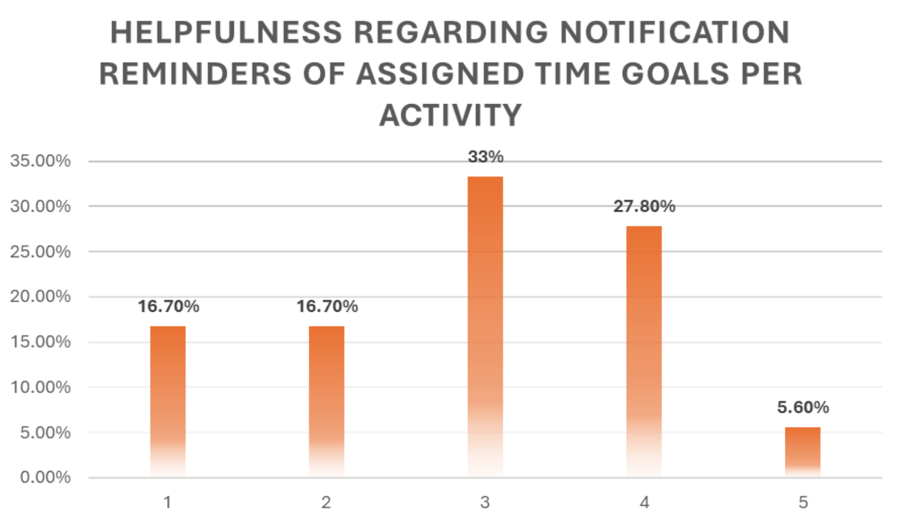
✦Supporting Visual Elements for Goal Management
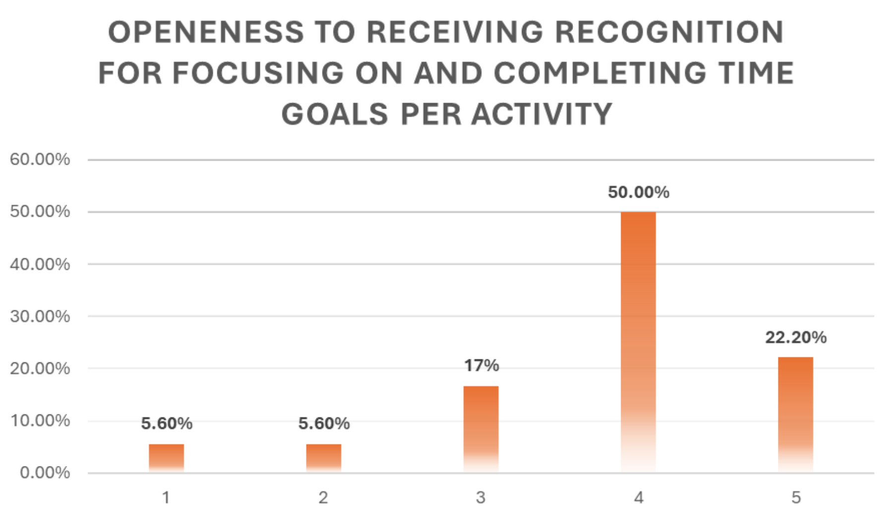
✦Encouraging Messages for Allotted Time, When Tracking Goals
Users struggle to balance their digital consumption with their desired well-being. Despite recognizing the negative impact of excessive screen time, particularly on sleep and focus, they find it challenging to implement lasting changes. Existing strategies, like deleting apps or setting time limits, often fail due to the fear of missing out (FOMO), the need for communication tools, and a lack of engaging support systems to reinforce positive change. Ultimately, users express a desire for tools that not only track usage but also motivate and encourage healthier digital habits.
This solution focuses on empowering users to achieve their personal goals by incorporating several key features. It emphasizes the reframing and refocusing of individual goals, allowing users to define what success looks like for them. To aid in this process, the solution includes supportive visual elements that facilitate goal management, progress tracking, and provide a clear overview of achievements. Furthermore, the solution integrates encouraging messages that are triggered by allotted time and goal tracking milestones, providing positive reinforcement and motivation for users to stay on track. By combining goal setting with visual feedback and positive reinforcement, this solution fosters lasting behavioral change.
Research
User Questionnaire
This project's research phase relied on an online questionnaire to gather user insights from 18 participants. The questionnaire explored user behaviors, preferences, and challenges related to managing screen time and digital distractions. The data collected provided a broad understanding of the target audience's needs and informed the subsequent design decisions.
Observations in Summary
✦Watching videos during meals was a common practice
✦Feeling more present and connected with others when reducing screentime
✦Social media consumption report was often ignored or forgotten
✦Social media apps were sometimes deleted, but often re-downloaded due to FOMO
✦Built-in time limits were bypasses, hindering efforts to reduce screen time
✦Removing devices from view were ineffective due to the need for communication tools
✦Excessive scrolling at night led to poorer sleep quality (self-reported)
✦Recognized scrolling as a negative use of downtime and relaxation

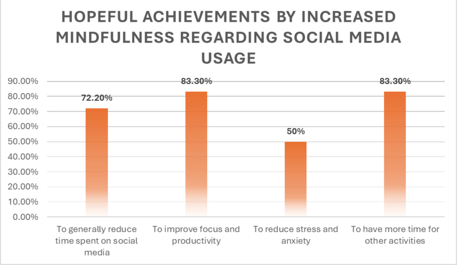
✦Hoped to better focus on other aspects of their lives, improve focus, and overall reduce time on social media
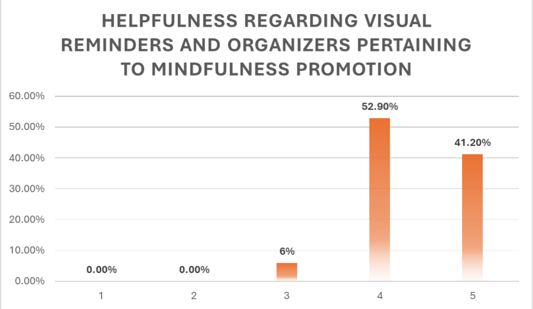
✦Visual elements to support goals would be helpful
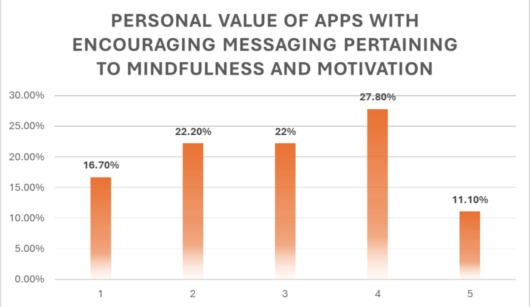
✦Encouraging messages and recognition of achieving personal goals were also warmly welcomed
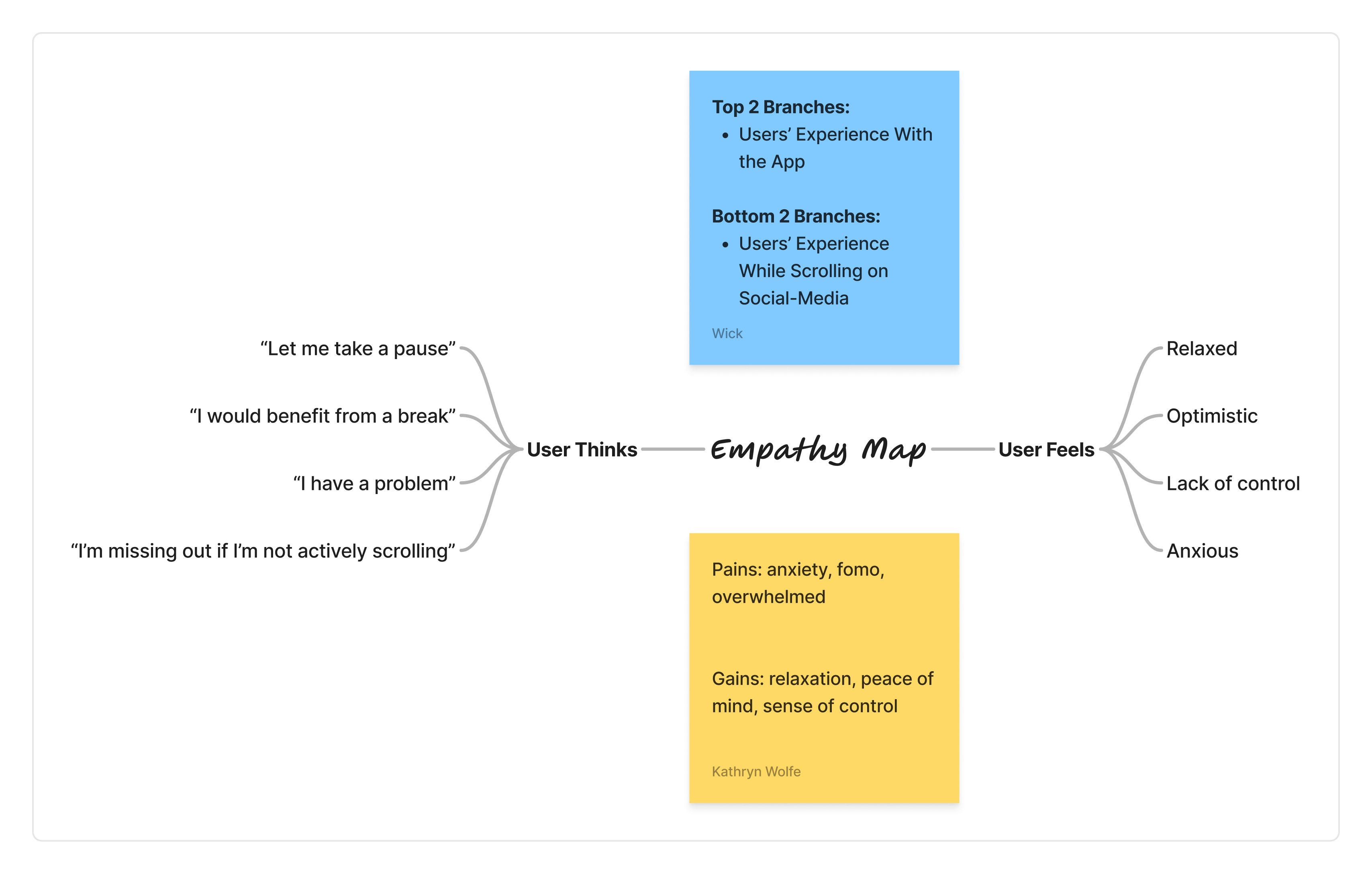
Empathy Map
User Sentiment Analysis
Current State: Anxiety, lack of control, and a "problematic overuse" cycle fueled by scrolling pressure.
Internal Monologue: "I would benefit from a break" vs. "I’m missing out if I’m not active."
Desired State: A restored sense of control and mental peace through healthier digital habits.
Competitor Analysis
A quickened competitor analysis was conducted on various time managament applications:
✦OffScreen
✦Daylio
✦Opal
✦Headspace
✦Calm
Time management apps often fail due to:
✦Ineffective mechanisms like rigid time limits that are hard to maintain
✦Shared achievements that create counterproductive anxiety
✦Simplistic app blocking that users easily circumvent.
These shortcomings present opportunities for better UX design.
User Personas


The Struggling Aspirer
✧Young adult (18-25), student or early career professional
Tech Savviness:
✧Comfortable with technology but struggles with self-control in the digital space.
Social Media Behavior:
✧Heavy user, primarily for passive consumption (watching videos, scrolling).
✧Aware of negative impact but struggles with FOMO and lacks the discipline to implement long-term changes.
Motivations:
✧Desire for increased productivity, improved skills, and better sleep.
Pain Points:
✧Lack of self-control
✧Easily distracted by social media
✧Avoids confronting usage data.
Solutions:
✧Simple, drastic measures (app deletion)
✧Strong visual reminders
✧Accountability mechanisms
✧Techniques to address FOMO.
The Data-Driven Improver
✧Young adult or adult (20-35), likely working professional.
Tech Savviness:
✧Comfortable with technology, uses digital tools for organization.
Social Media Behavior:
✧Moderate user, aware of excessive usage and willing to make changes. Responds well to data and factual evidence.
Motivations:
✧Seeking better work-life balance, improved rest and productivity.
Pain Points:
✧May lack awareness of effective strategies to reduce screen time
✧May find digital notifications overwhelming.
Solutions:
✧Data-driven feedback and insights
✧Personalized recommendations for screen time management
✧Integration with existing organizational tools.
The Challenge
Problem Statement:
Project Goals:


Inspire Personal Goals
Encouraging Support
Simple & Gentle Design
Value-Driven Goal Setting: Facilitating a process where users define meaningful aspirations through guided reflection on their individual priorities.
Behavioral Nudges: Implementing motivational "nudges" and strategic adjustments to maintain user momentum and long-term engagement.
Actionable Data Visualization: Transforming quantitative milestones into qualitative recommendations that empower users to refine their approach.
Calming Aesthetic: Utilizing a warm and inviting visual language to transform goal-tracking from a stressful chore into a restorative practice.
Frictionless Engagement: Removing "visual noise" and unnecessary complexity to create an approachable environment for daily reflection.
Design
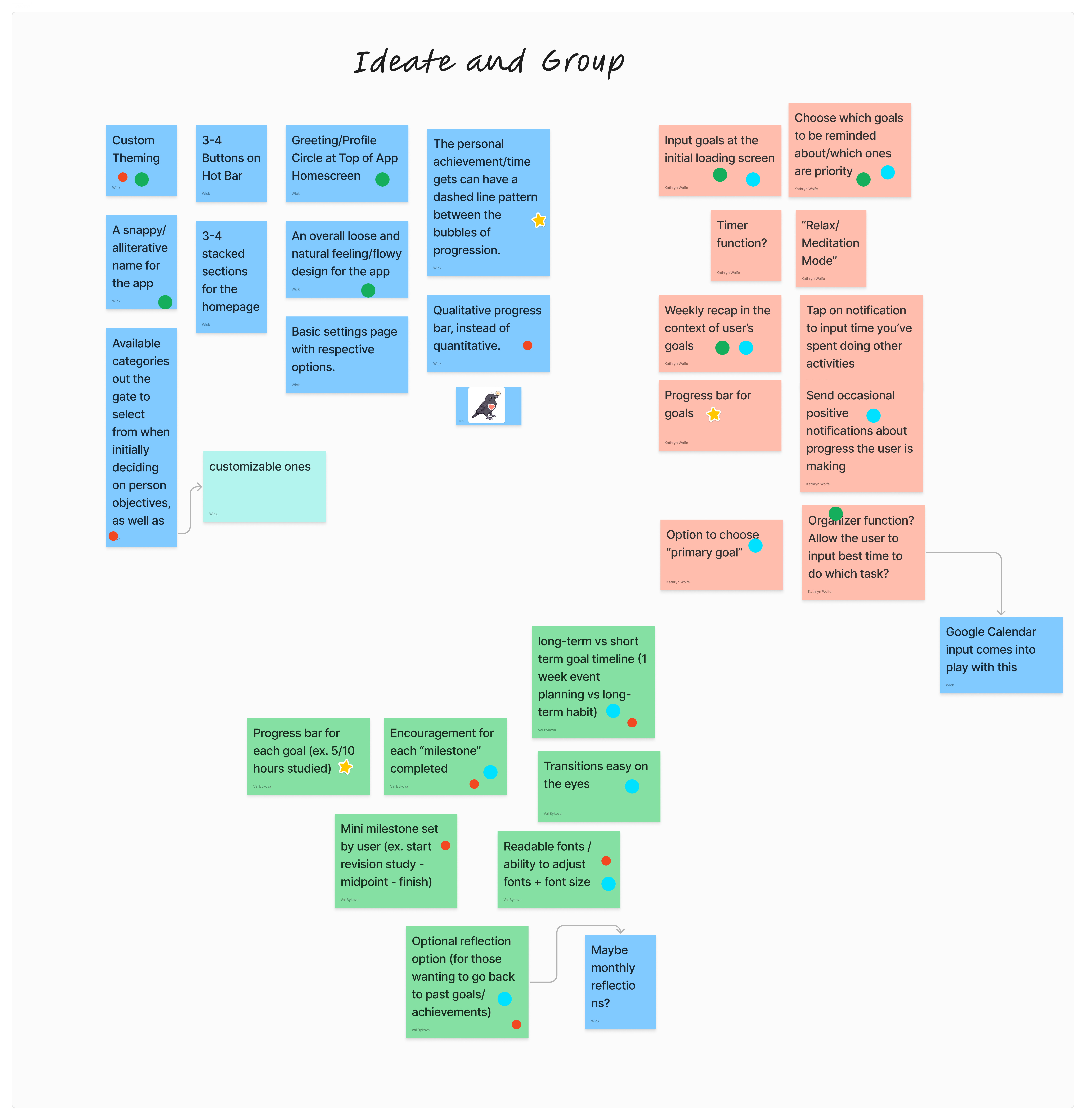
Ideation
Collaborative Brainstorming: A team of three designers utilized Figma to brainstorm research-backed solutions independently.
Rapid Prioritization: Following individual ideation, the team conducted a 15-minute dot voting session to align on the most promising concepts.
Information Architecture
Reduced Cognitive Load: A flat navigation hierarchy minimizes "choice paralysis" and ensures users reach core features in two taps or less.
Mindful Navigation: Streamlined architecture avoids feature creep, focusing solely on three pillars: Goal Setting, Tracking, and Reflection.
Intentional Friction: Designed to minimize time-on-device, promoting mindful technology use rather than endless scrolling.
Design Decisions

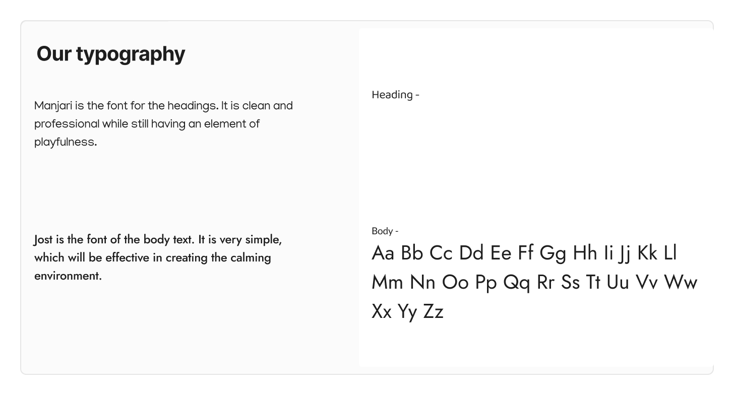
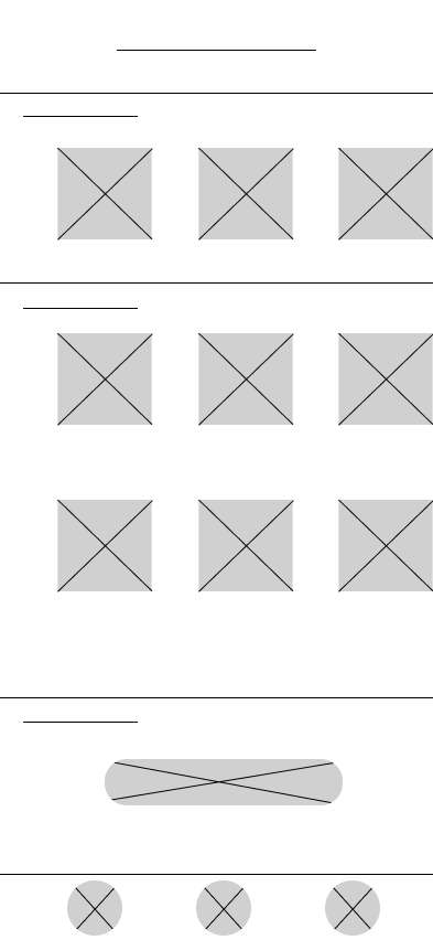
Wireframing & Low-Fi
Fidelity Progression: Transitioned from rapid, hand-drawn sketches to mid-fidelity digital mockups to refine layout and flow.
Softened Visual Language: Introduced rounded UI elements and a "gentle" aesthetic during the digital phase to enhance approachability.
Psychological Safety: Strategically utilized softer shapes to reduce visual harshness, creating a more inviting environment for the user.
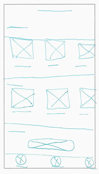
Hand-Drawn Wireframing
Digital Wireframing
Low-Fidelity
Mid-Fidelity
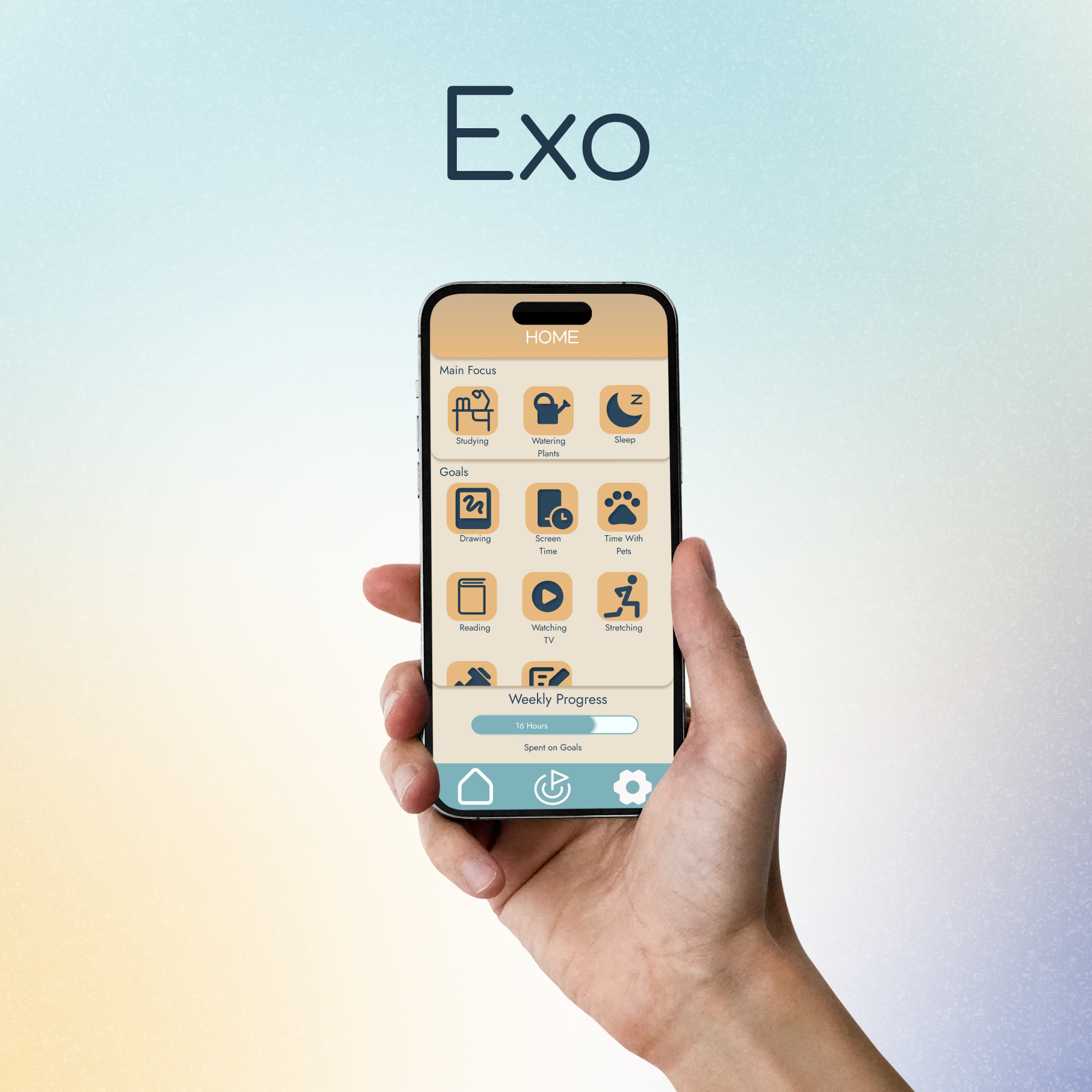
The Solution: Key Features and Benefits
Prototypes & Results
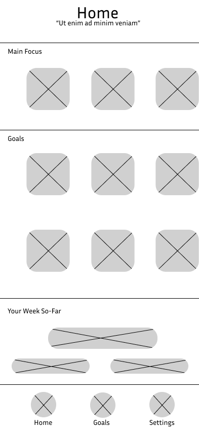
The high-fidelity prototypes for Exo represent the culmination of my research-driven process. By mapping out the Onboarding, Home, Goals, and Settings modules, I created a tangible demonstration of the app’s navigation and "gentle" visual identity. These designs bring the proposed user experience to life, showcasing a functional, refined environment where users can engage with their aspirations without the friction of digital overload.
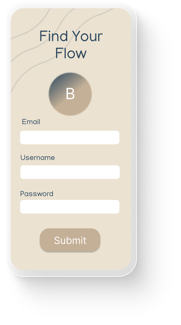
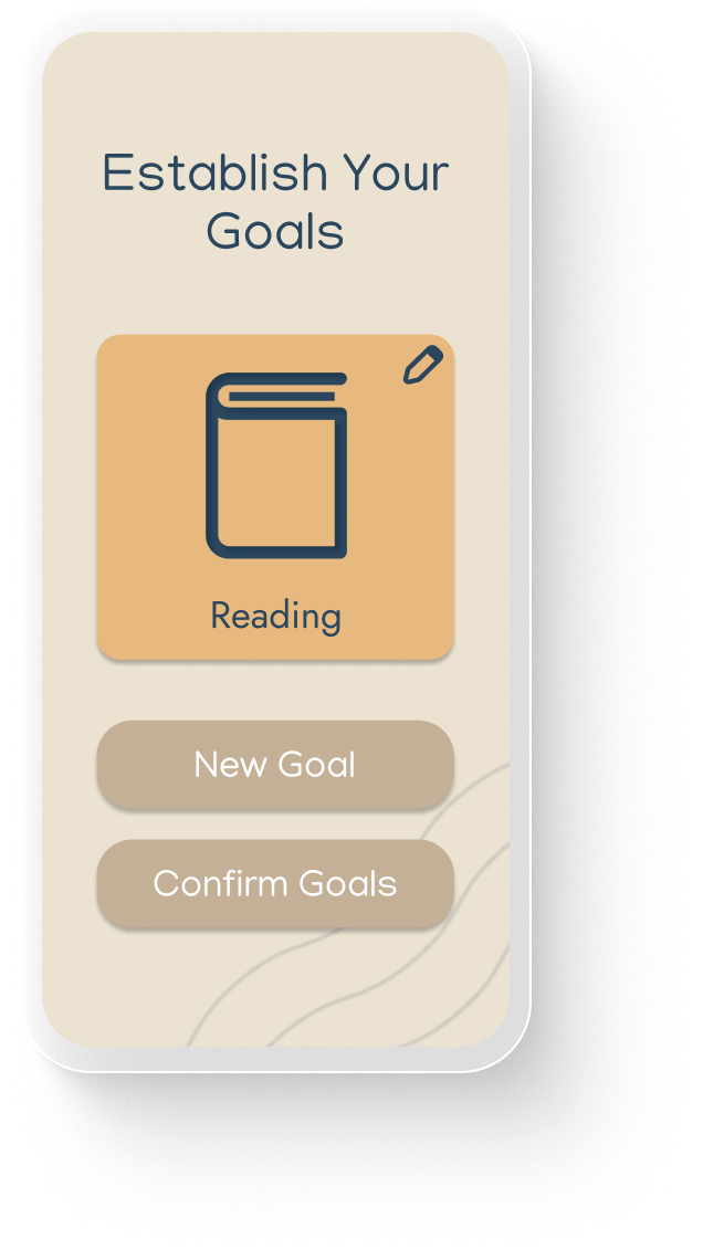
Onboarding
Frictionless Entry: A streamlined account setup that minimizes cognitive load and time-to-value.
Immediate Personalization: Integrated goal configuration that allows users to shape their experience from the very first minute.
Seamless Transition: A cohesive flow from branded loading to active use, preventing "onboarding fatigue.
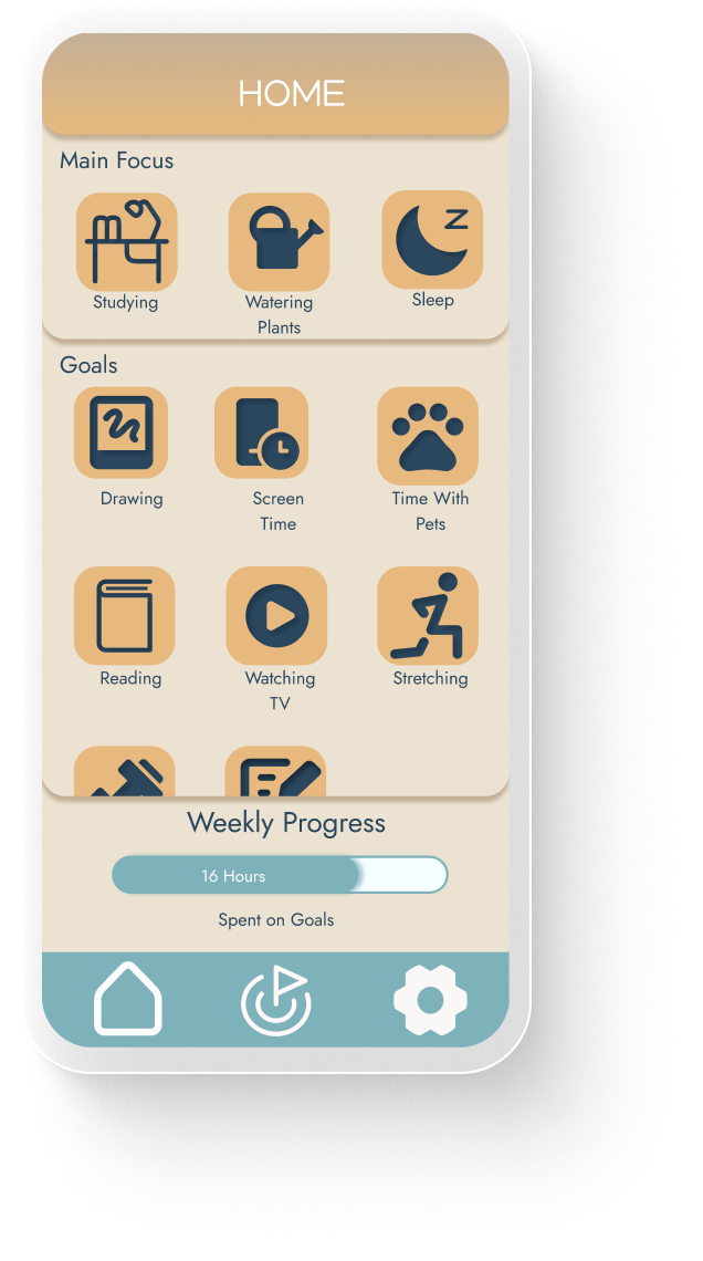
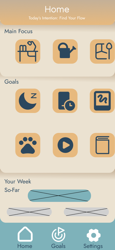
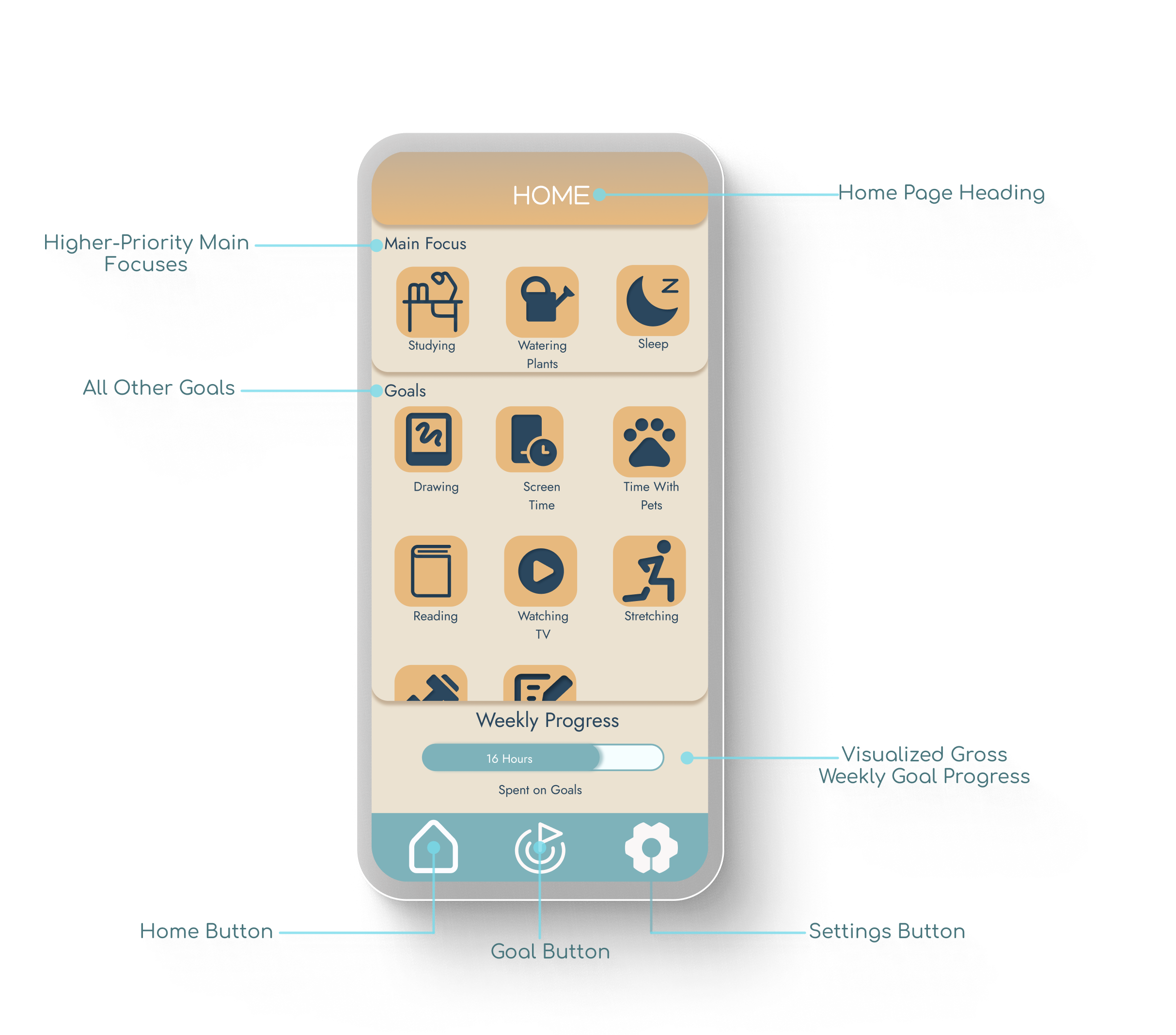
Home Page
Visual Prioritization: Places primary focus goals at the top to ensure the user’s most important objectives remain top-of-mind.
Centralized Goal Hub: Organized list of all active secondary goals for quick review and navigation.
High-Level Tracking: A cumulative weekly progress bar provides a "gentle" snapshot of overall achievement without overwhelming the user with granular data.
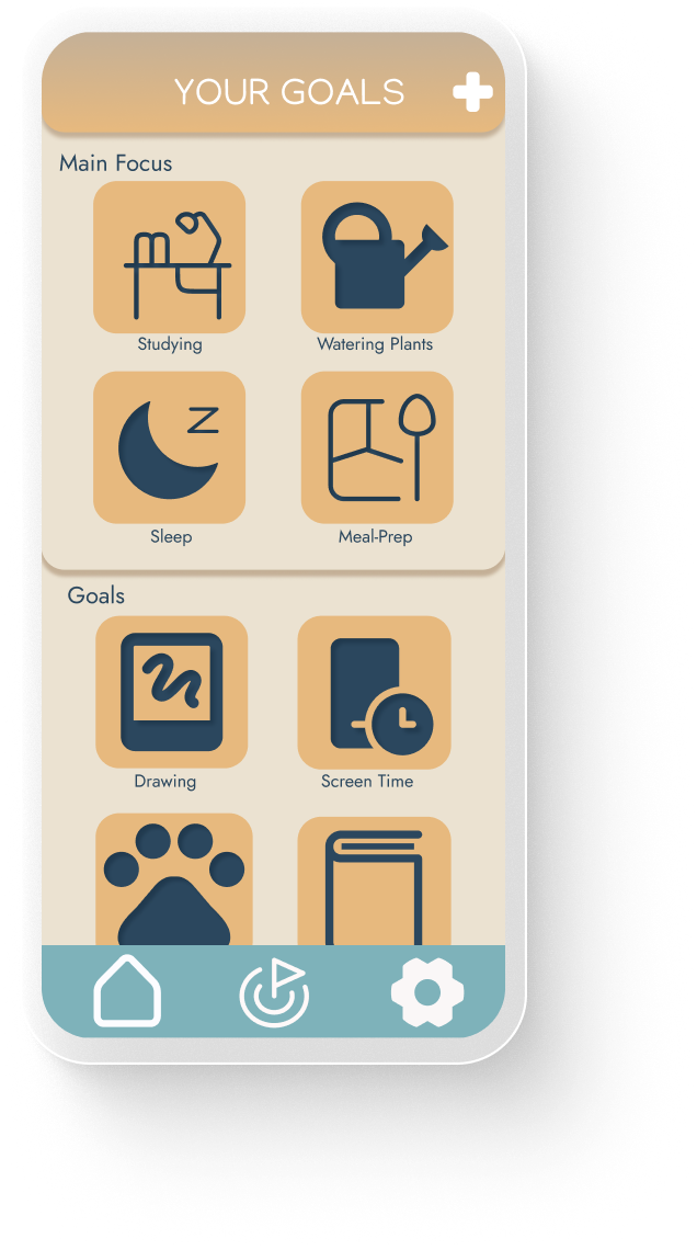
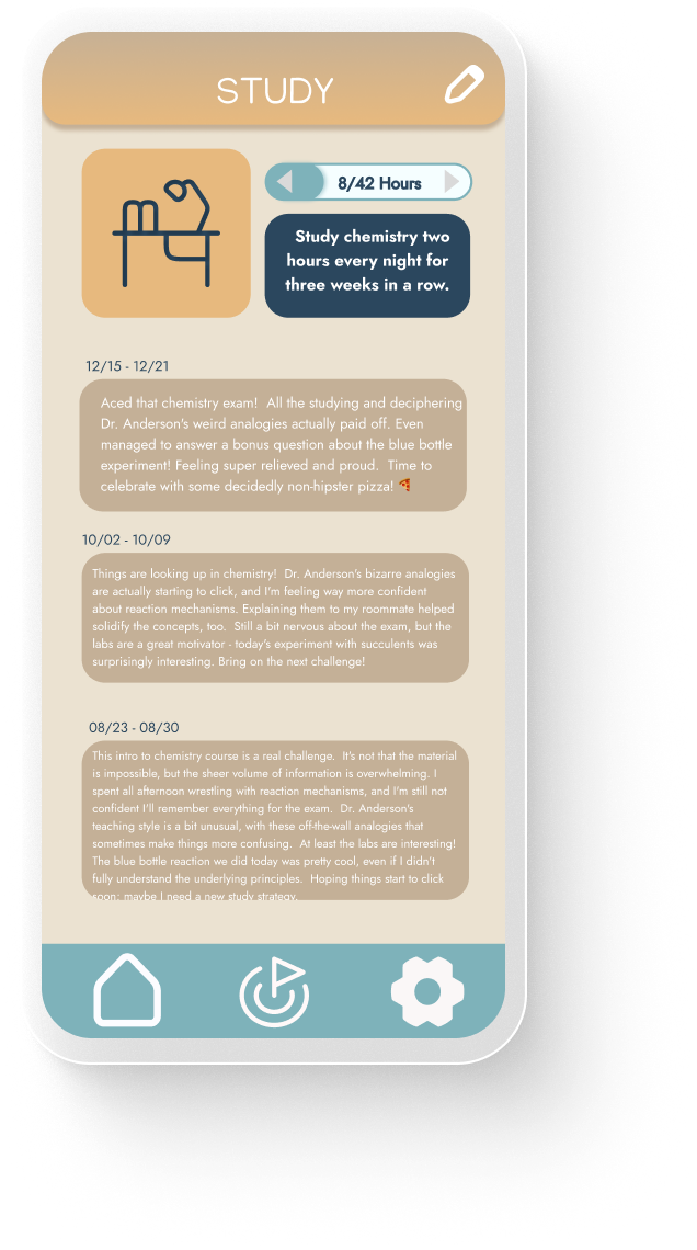
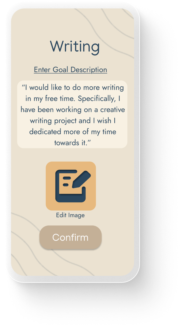
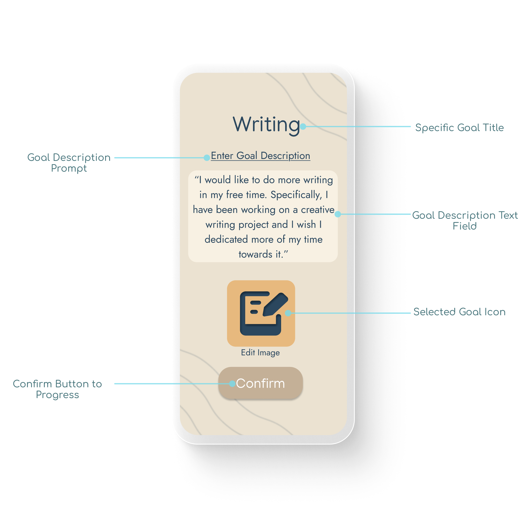
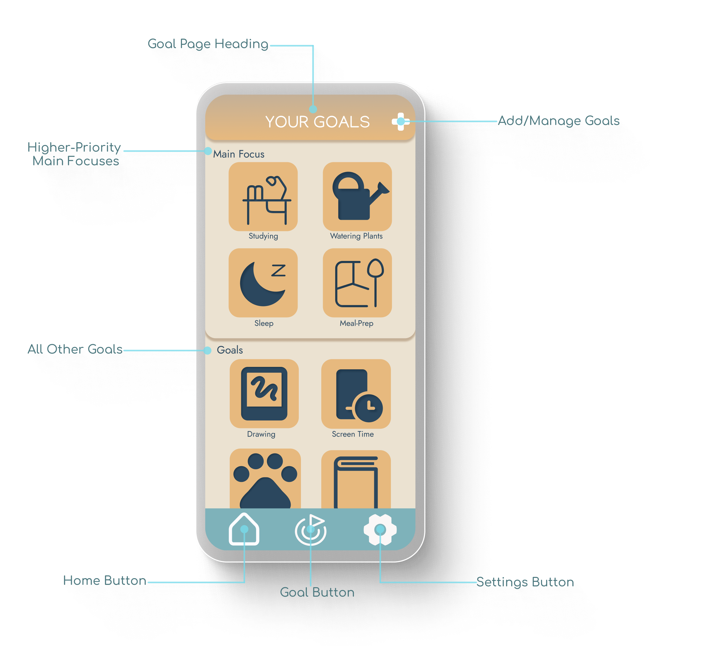
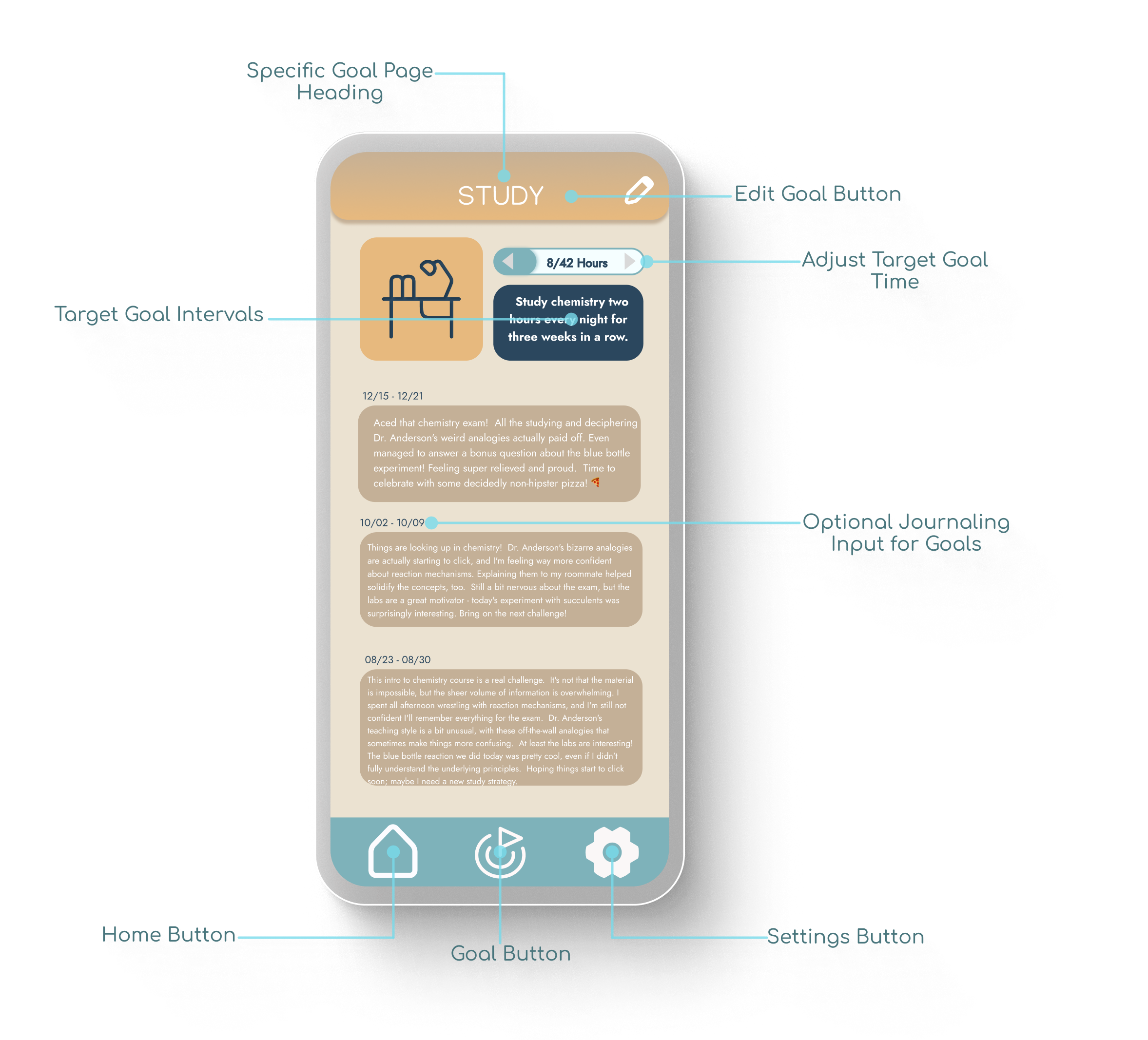
Goal Page
Mental Model Consistency: Mirrors the homepage’s goal hierarchy to ensure a predictable and low-friction user experience.
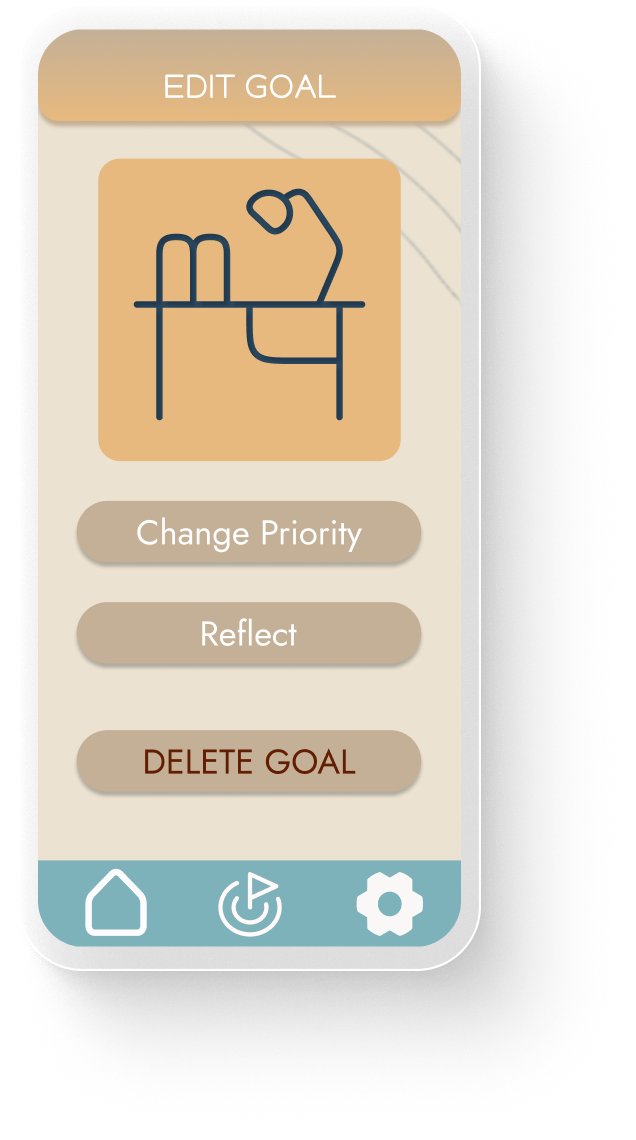
Granular Goal Management: Provides a dedicated space to add, edit, or remove goals, giving users full control over their personal growth journey.
Qualitative Tracking: Features an integrated journaling tool, allowing users to move beyond numbers and document the "why" behind their progress.
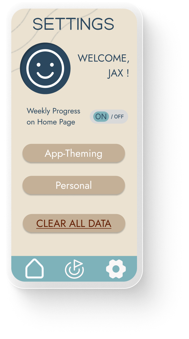
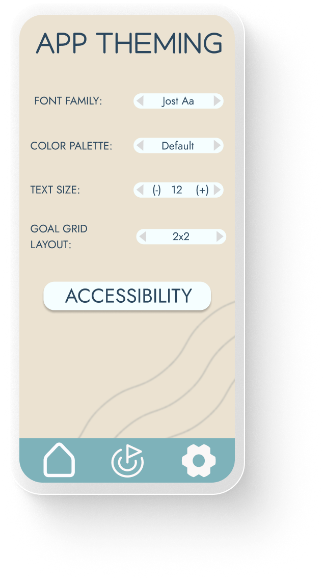
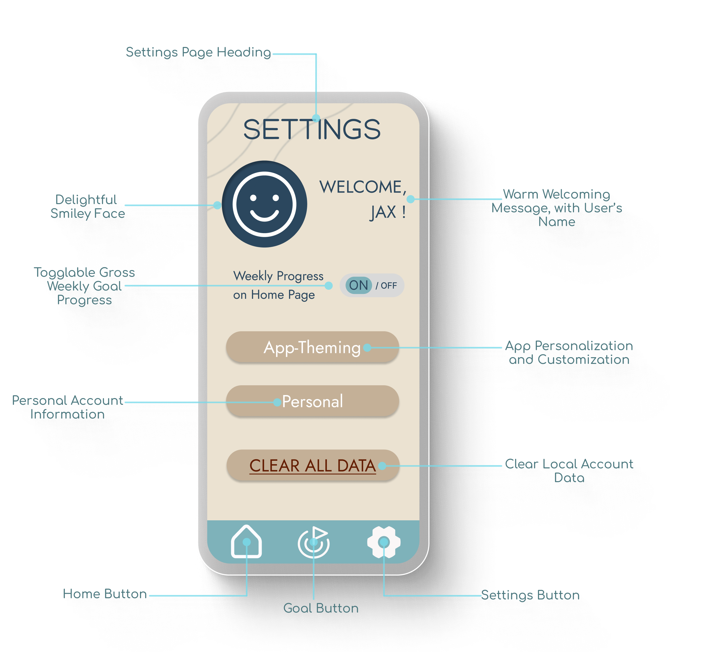
Settings
User Autonomy: Allows users to toggle the cumulative progress bar, acknowledging that for some, visual tracking can induce anxiety rather than motivation.
Inclusive Design: Dedicated accessibility preferences to ensure the interface is usable for a diverse range of cognitive and physical needs.
Personalized Aesthetics: Options to adjust the app’s appearance, reinforcing the "warm and inviting" core design goal.
Iterative Learnings
Future Directions
Future development of this hypothetical mobile app would involve iterative improvements based on user feedback and data analysis:
UX Case Studies