Navigation:
4.8/5
Steam Mobile Redesign
Mobile App Redesign
Role
Lead UX Designer, Researcher, Information Architect
Project Type
Mobile App Redesign
Team Size
1
Timeline
December 2024-Februrary 2025
Project Description
This redesign addresses the friction points in the current Steam Mobile app: poor navigation, inefficient workflows, and outdated visuals.
By restructuring the Information Architecture and reconfiguring the hot-bar, there was streamlined access to high-frequency features like friend activity and trade confirmations.
The result is a modernized interface that improves task efficiency and social connectivity while staying true to the established Steam brand.
View Project
Steam Mobile: Redesigned and Redefined
The Problem
The Solution
✦Confusing Navigation
✦Inefficient Workflows
✦Unclear Visual Hierarchy
✦Buried Social Features
✦Lack of Personalization
✦Inefficient Workflows
✦Unclear Visual Hierarchy
✦Buried Social Features
✦Lack of Personalization
✦Reconfigure the hot-bar and the elements within it
✦Tidy up the visual hierarchy
✦Reduce less applicable information per page
✦Provide an overall modern, but true to brand, feel of the application
✦Tidy up the visual hierarchy
✦Reduce less applicable information per page
✦Provide an overall modern, but true to brand, feel of the application
The Steam mobile app's current design hinders user experience due to poor navigation, inefficient workflows, and a lack of visual appeal, leading to frustration and confusion. Users struggle with the app's confusing layout, which makes it difficult to find what they need. Completing tasks often requires unnecessary steps, particularly in the confirmations menu. The app lacks clear visual cues and hierarchy, making it challenging to understand the interface. Accessing information about friends' activities is also cumbersome. These issues result in a suboptimal user experience.
The redesign enhances the Steam mobile experience by reconfiguring the hot-bar for better access to frequently used features, and reorganizing the visual hierarchy for clearer navigation. Less pertinent information is reduced or reorganized on each page to streamline workflows. The app's aesthetic is modernized while remaining true to the Steam brand. These changes aim to create a more intuitive, efficient, and enjoyable experience.
Research
User Interviews
Qualitative Interviews Revealed:
✦Application Pain Points
✦Identified a Common Pattern in User Flows
✦Brought Attention to User Wants
The interviews were conducted both in person and virtual, depending on the participants availability. In total there were five interviews, primarily consisting of college age men who used the steam platform to enjoy gaming. The environment for each interview was relaxed, with a more casual approach to the interactions had between the interviewer and interviewee; the interviews lasted on average no longer than 15 minutes.
Observations in Summary
Most Used Features:
✦Deals and Sales in the Store
✦Steam Guard and Confirmations
✦Adding Friends
✦Viewing Game Library
✦Viewing Game Captures
✦Deals and Sales in the Store
✦Steam Guard and Confirmations
✦Adding Friends
✦Viewing Game Library
✦Viewing Game Captures
Pain Points:
✦Store UI is too small, "clunky", and features feel cluttered/buried
✦The recommended titles are not immediate within the store
✦Visual Design lacks modernization and streamlining
✦Store UI is too small, "clunky", and features feel cluttered/buried
✦The recommended titles are not immediate within the store
✦Visual Design lacks modernization and streamlining
Typical User Flow:
✦Utilizing Steam Guard/Confirmations
✦Viewing the store for deals or discounted wish list items
✦Utilizing Steam Guard/Confirmations
✦Viewing the store for deals or discounted wish list items
80% of interviewees were unable to locate the settings in the current state of the mobile application
Input on Friends Feature:
✦The number of interactions required to view the friends section need to be reduced
✦Certain elements of the friends section from the desktop can be utilized to reduce parity issues and increase functionality
✦Online friends and their current game they are in should be easily visible
✦The number of interactions required to view the friends section need to be reduced
✦Certain elements of the friends section from the desktop can be utilized to reduce parity issues and increase functionality
✦Online friends and their current game they are in should be easily visible
Empathy Map
The Steam mobile app user, as depicted in the empathy map, thinks about wanting feature parity with the desktop version, a more organized and intuitive interface, and seamless access to information.
They feel frustrated by the app's clunkiness, inefficiency, and outdated design, experiencing confusion due to poor navigation and a lack of clear visual hierarchy.
They say things like "Organize it more like the desktop Steam page," expressing specific pain points with confirmations, navigation, and feature discoverability.
Consequently, they do things like struggle with basic tasks, often resorting to the desktop app instead, and express frustration with the app's slow performance and cumbersome interface.
Ultimately, the empathy map reveals a significant gap between user expectations for a streamlined and enjoyable mobile experience and the current app's shortcomings, highlighting a strong need for a user-centered redesign.
Pains and Gains
Analysis of user feedback and usability testing revealed key pain points centering around usability issues like slow and cumbersome interfaces, outdated visual design, unreliable performance, and a lack of feature parity with the desktop version. Addressing these pains, the redesign aims to deliver gains in enhanced user flow and navigation, improved community engagement, increased performance and reliability, and a more consistent cross-platform experience.
Pains:
Usability Issues: Slow, cumbersome interface with a confusing and disorganized layout, hindering efficient navigation.
Visual Design: Outdated appearance and lack of visual feedback, impacting user engagement and satisfaction.
Performance & Reliability: Unreliable and unstable app experience, leading to frustration and distrust.
Feature Parity: Limited mobile functionality compared to the desktop version, creating an inconsistent user experience across platforms.
Gains:
Enhanced User Flow & Navigation: Streamlined user flow and intuitive interface with clear hierarchy and easy navigation.
Improved Community Engagement: Enhanced community features and friend activity tracking to foster user connection.
Performance & Reliability: Reliable and stable app experience with improved visual feedback and responsiveness.
Competitor Analysis
Benchmarking against Xbox, PlayStation, and Nintendo revealed that while competitors successfully integrate social ecosystems and remote play, Steam's mobile experience lagged in connectivity. This analysis validated the redesign's focus on elevating community features and modernizing navigation to align with the standards set by console companion apps.
Xbox:
Competitor Type: Direct
Audience: Typically, a Mature Audience
Product Offering: Social, Voice-chat, Game Library, Store, News, Profile
Outstanding: Easy to navigate, visually appealing, efficient design
Interaction: Outstanding: User Flow and Navigation. Okay: Accessibility limited to two options
Competitor Type: Direct
Audience: Typically, a Mature Audience
Product Offering: Social, Voice-chat, Game Library, Store, News, Profile
Outstanding: Easy to navigate, visually appealing, efficient design
Interaction: Outstanding: User Flow and Navigation. Okay: Accessibility limited to two options
PlayStation:
Competitor Type: Direct
Audience: Typically, a Mature Audience
Product Offering: Social, Voice-chat, Game Library, Store, News, Profile
First Impression: Good: Distinct sections, but certain design elements felt outdated
Interaction: Outstanding: User flow and Navigation. Poor: Accessibility elements not present
Nintendo Online:
Competitor Type: Indirect
Audience: Typically, Family Friendly
Product Offering: Friends Feed, Game Specific Services, Voice-chat
First Impression: Okay: Accomplished its intended goal, but minimal use otherwise
Interaction: Good: User flow and Navigation. Poor: Accessibility elements not present
Competitor Type: Indirect
Audience: Typically, Family Friendly
Product Offering: Friends Feed, Game Specific Services, Voice-chat
First Impression: Okay: Accomplished its intended goal, but minimal use otherwise
Interaction: Good: User flow and Navigation. Poor: Accessibility elements not present
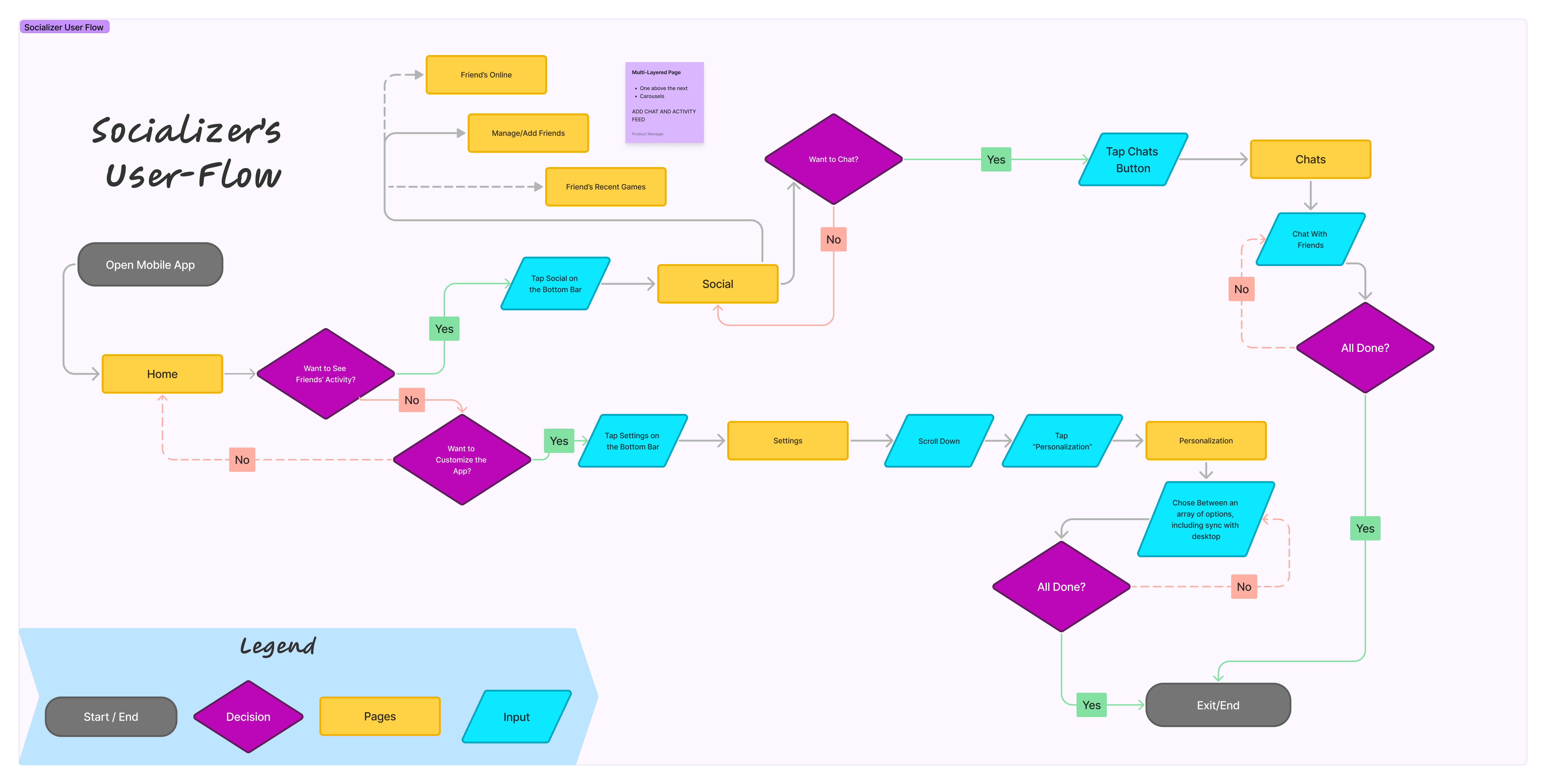
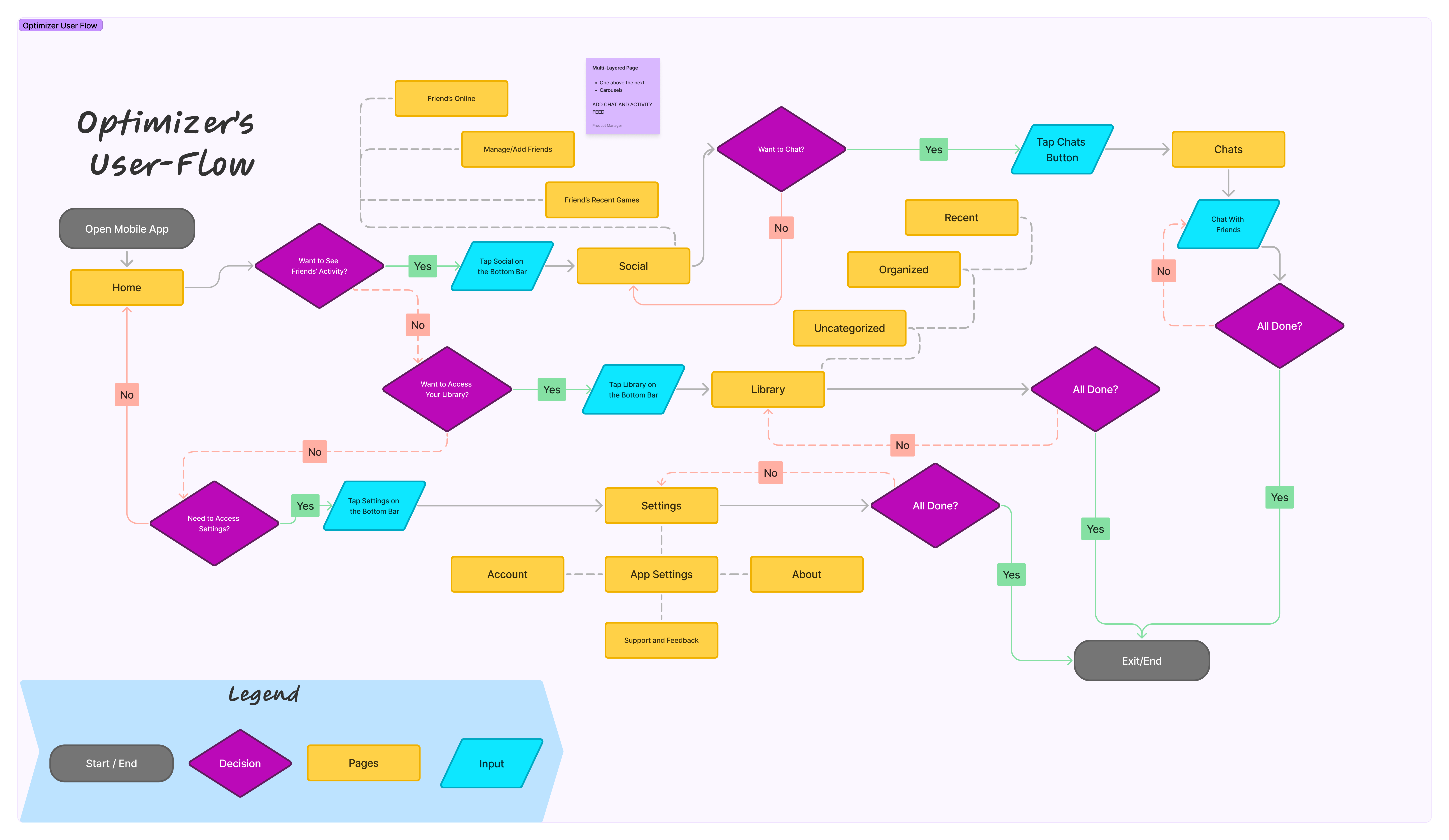
User Personas & User Flows


Socializer
Background:
✧A student who uses gaming as a primary way to connect with friends.
Goals:
✧See what their friends are playing and join them in games.
✧Easily chat and interact with friends within the app.
✧Discover new games their friends are enjoying.
Pain-points:
✧Difficulty finding and viewing friend activity.
✧Lack of social features and integration within the app.
✧Limited ability to personalize the app's appearance.
Solutions:
✧A more social and engaging app experience.
✧Prominent display of friend activity and online status.
✧Ability to customize the app's look and feel.
Optimizer
Background:
✧A busy professional who enjoys gaming in their limited free time.
Goals:
✧Quickly access and manage their game library.
✧Easily confirm trades and purchases.
✧Stay up-to-date on friend activity, especially for multiplayer games.
Pain-points:
✧Cumbersome confirmation process.
✧Difficulty finding and accessing settings.
✧Lack of clear friend activity information.
Solutions:
✧A streamlined and efficient app experience.
✧Clear navigation and easy access to key features.
✧Prominent display of friend activity and game invites.
The Challenge
Problem Statement:
“Jeffrey, a tech-savvy and frequent Steam user, needs a convenient and reliable way to access core Steam functionalities on their mobile device. However, the current app's clunky interface, inefficient navigation, and outdated design hinder them from seamlessly managing their account, connecting with friends, and staying engaged with the Steam community.”
Project Goals:


Reconfigured Hot-bar
Organization and Modernization
Added Social Features
Redesign the hotbar to provide instant access to essential features, transforming the mobile experience into an intuitive, user-centric platform.
Reorganize layouts to prioritize high-value workflows. The updated aesthetic would improve navigation efficiency for the library and store without losing the "Steam" feel.
Enhance the mobile social experience by making it easier for users to see what friends are playing and join them on the go.
Design
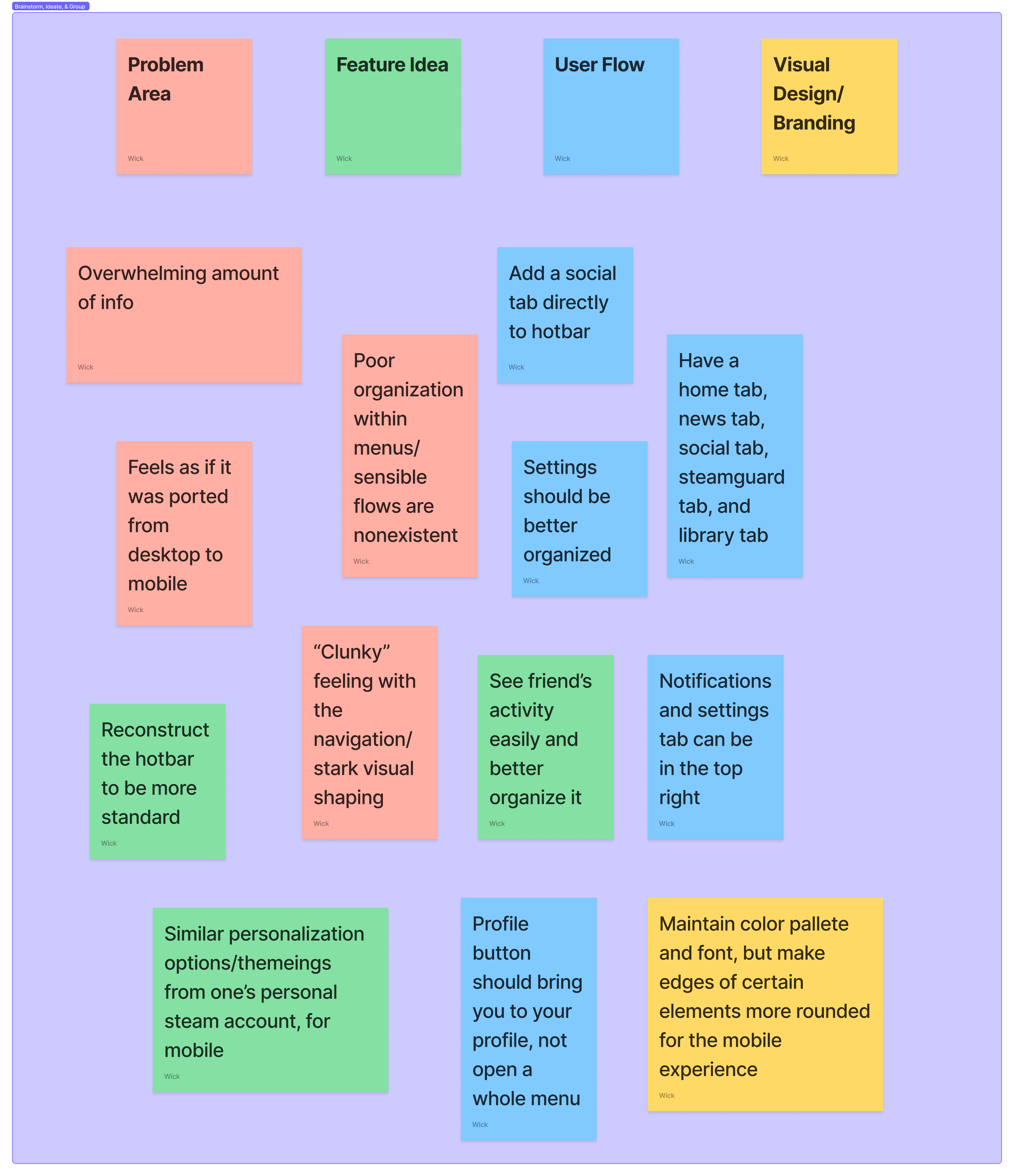
Ideation
My ideation phase centered on resolving navigation friction and user confusion through three key focus areas:
Navigation Efficiency: Overhauled the hot-bar and menus to simplify high-frequency tasks.
Modernized UI: Implemented established mobile patterns to reduce cognitive load and visual clutter.
Enhanced Social: Integrated prominent social features and personalization to meet modern user expectations.
Design Decisions
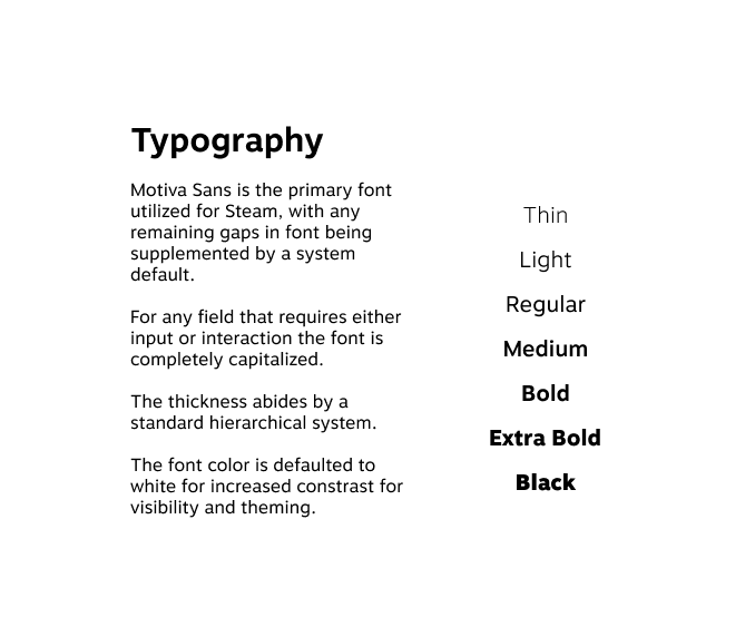
Typography: Standardized Motiva Sans across all screens to ensure typographic unity and brand alignment.
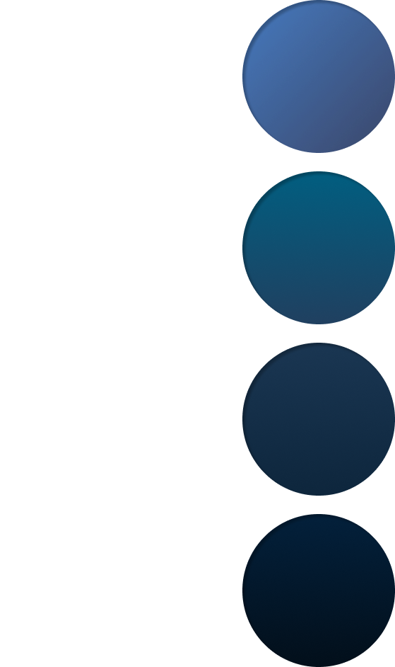
Color Palette: Preserved the signature dark grays and blacks, utilizing vibrant blues and teals as strategic accent colors for calls-to-action.
Visual Depth: Incorporated signature Steam gradients to add dimension and maintain the established brand aesthetic.
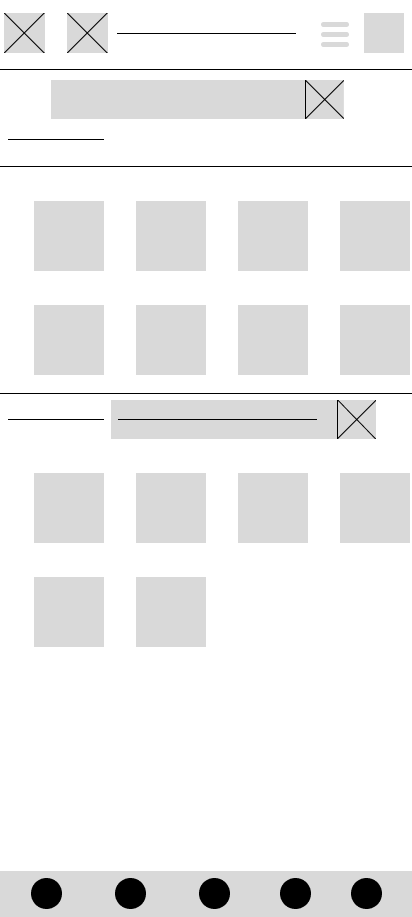
Wireframing
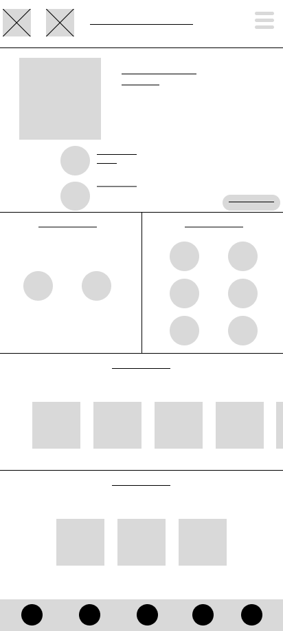
Research insights were translated into a structural blueprint, shifting away from desktop-centric elements to embrace mobile-first principles.
Touch Optimization: Reorganized the layout for smaller screens and intuitive thumb-zone interactions.
Decluttering: Prioritized essential features and implemented familiar mobile navigation patterns to reduce cognitive load.
Information Hierarchy: Established a new architecture to improve discoverability and ease of use.
.png)
Store
Library
Social


Profile
Steam Shield
Settings
The Solution: Key Features and Benefits
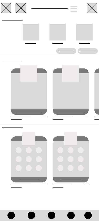
Prototypes & Results
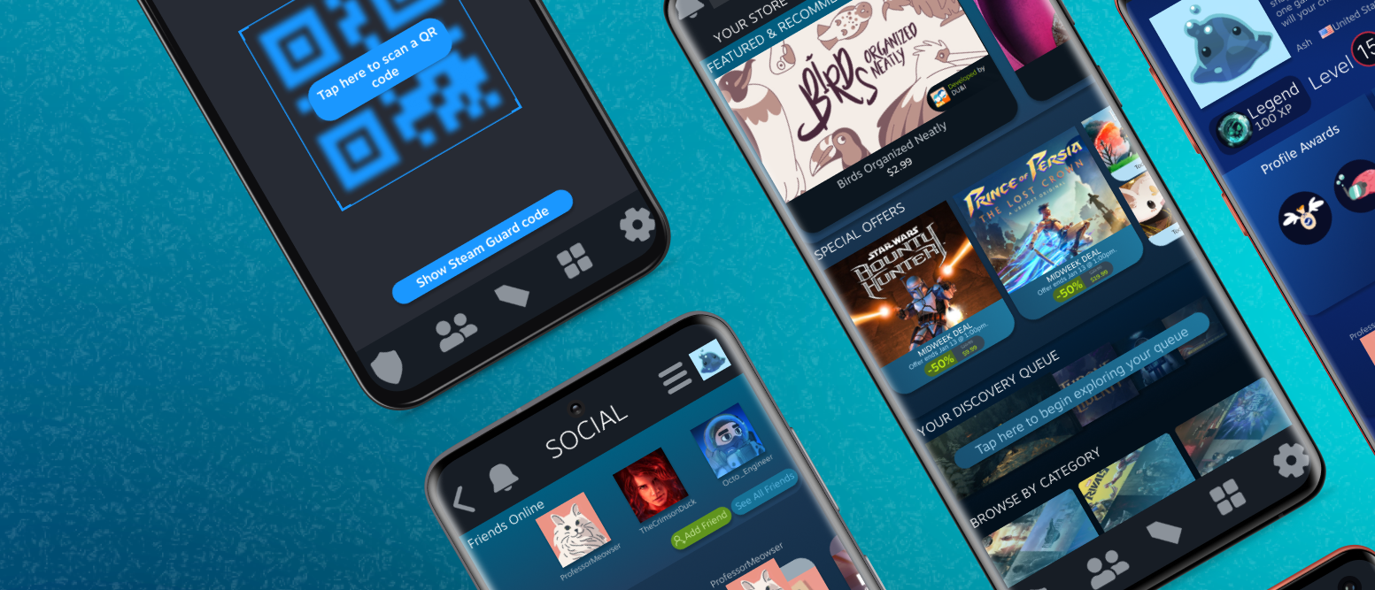
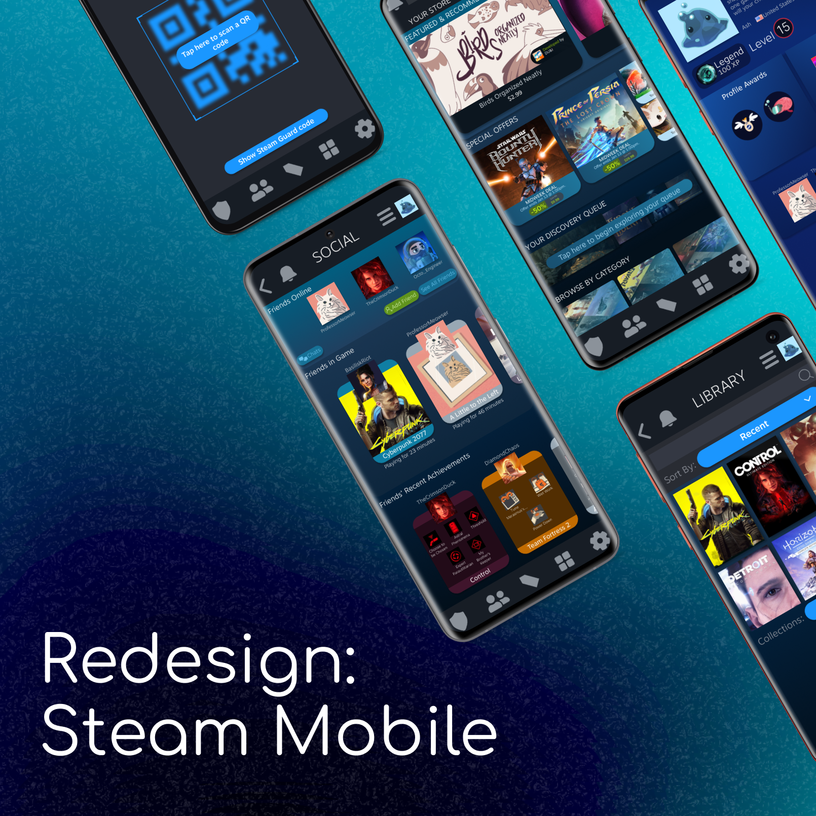
The final prototype transforms research and wireframes into a fully realized, mobile-first experience. I mapped end-to-end user flows across six core areas—Store, Library, Social, Profile, Steam Guard, and Settings—to validate a modernized navigation system. This interactive vision demonstrates a cohesive, enjoyable, and efficient platform that stays true to the Steam brand.
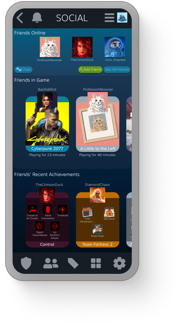
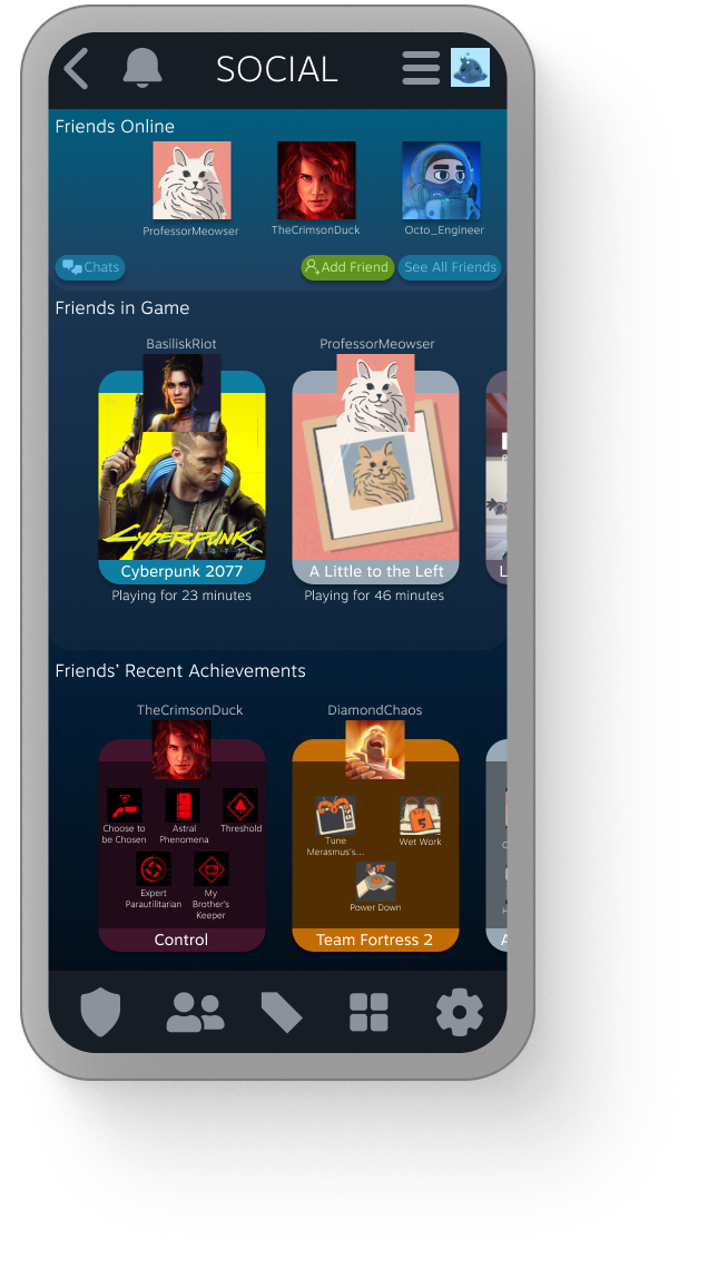
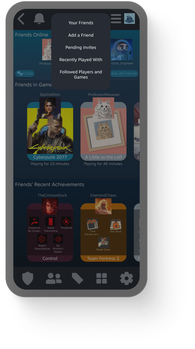
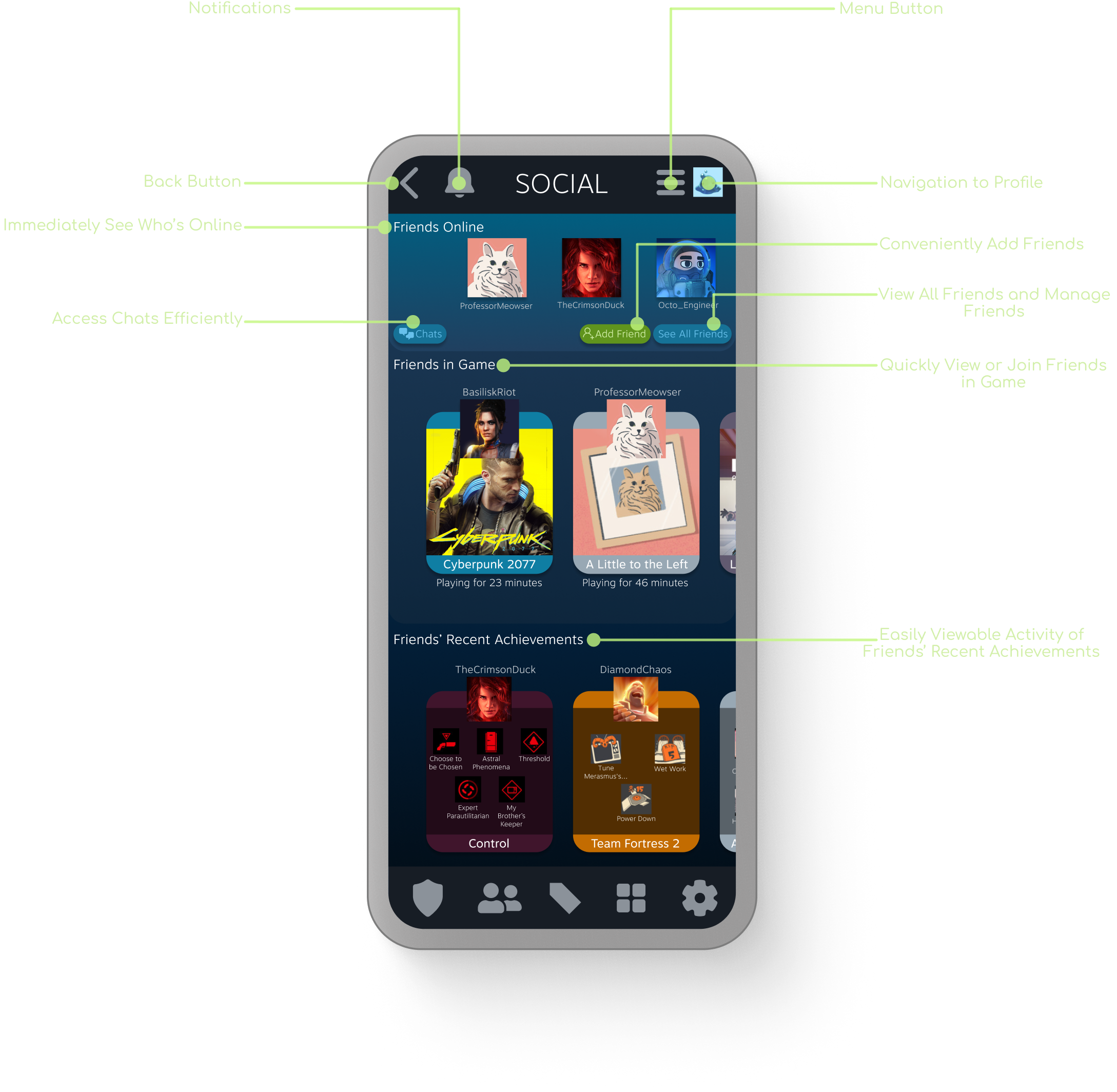
Social: Player Hub
Social-First Interaction: Prioritized friend connectivity by surfacing online status and current game activity at the top of the hierarchy.
At-a-Glance Activity: Streamlined the display of recent achievements and friend content for rapid, "on-the-go" viewing.
Modernized Visual Language: Leveraged rounded UI components and brand-authentic gradients to increase engagement and visual appeal.
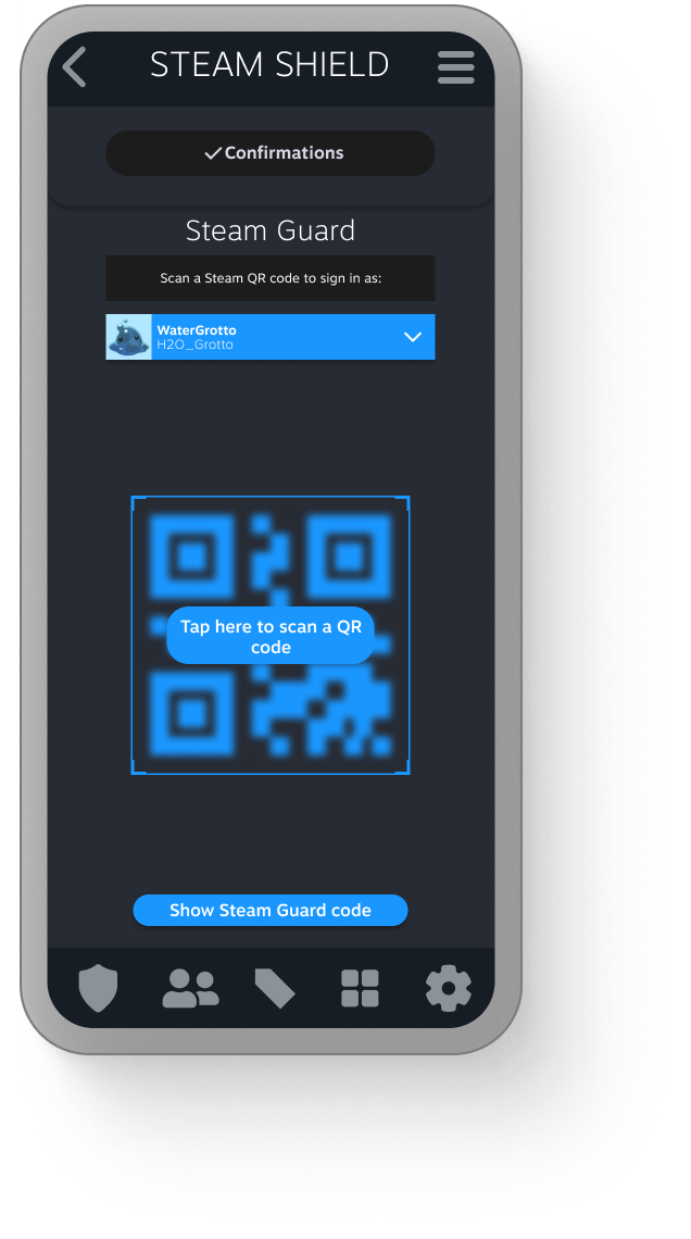
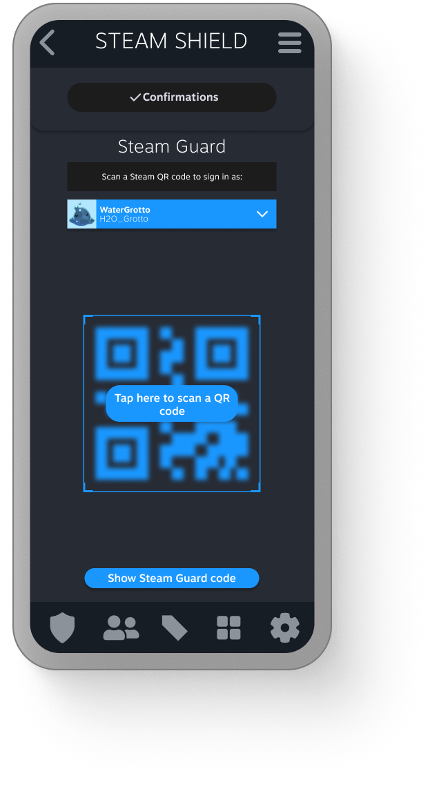
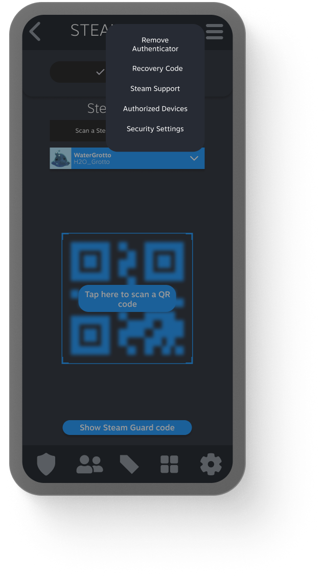
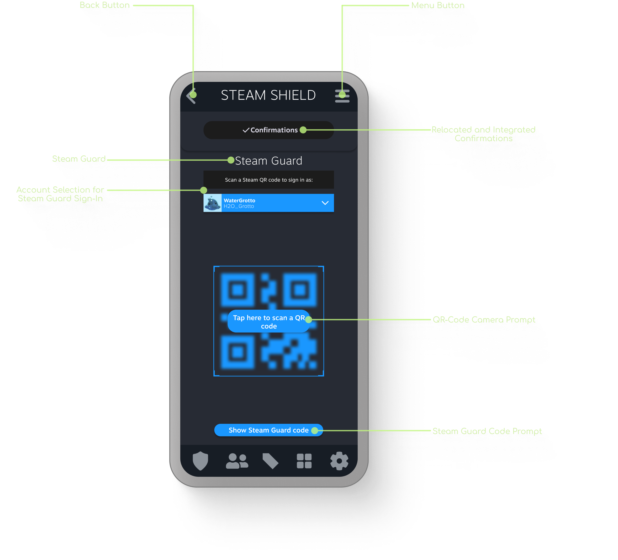
Steam Shield: Centralized Security
Unified Security Hub: Consolidated Steam Guard and trade confirmations into a single "Steam Shield" section to minimize navigation steps.
Direct Access: Relocated security features to the primary hot-bar, providing immediate access to high-frequency utility tasks.
Workflow Optimization: Centralized essential security workflows to improve user convenience without altering core backend functionality.
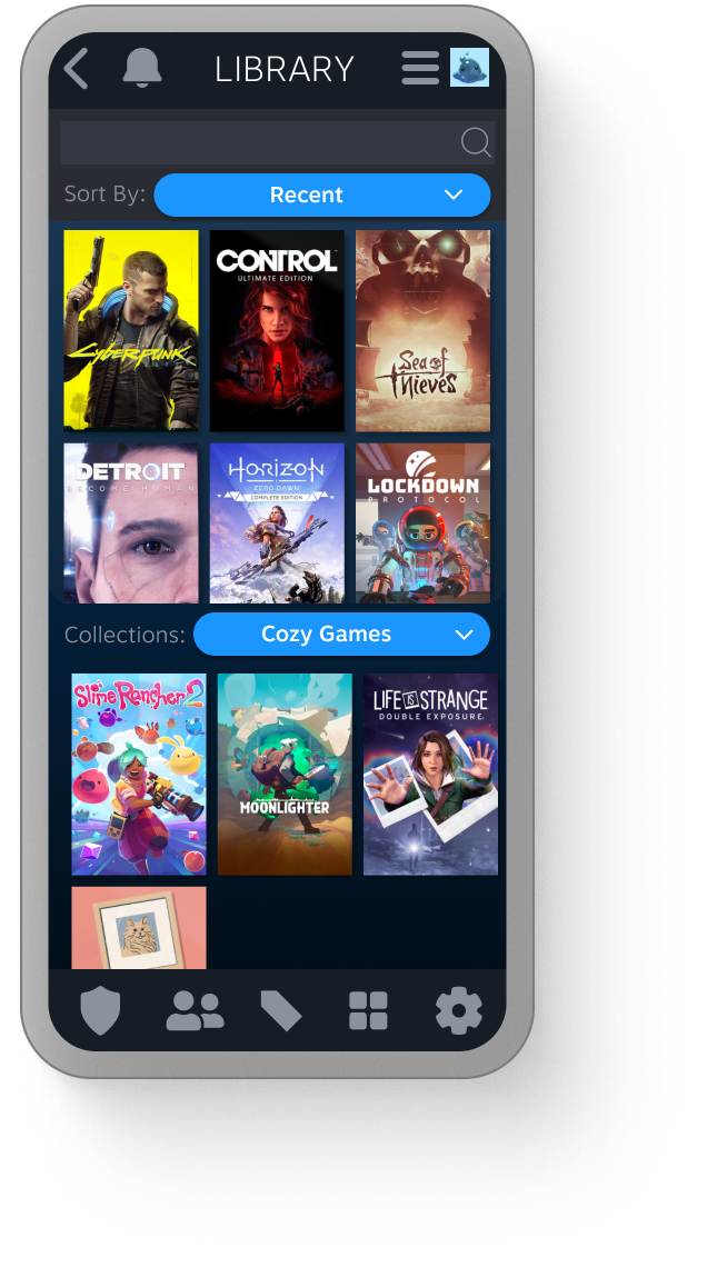
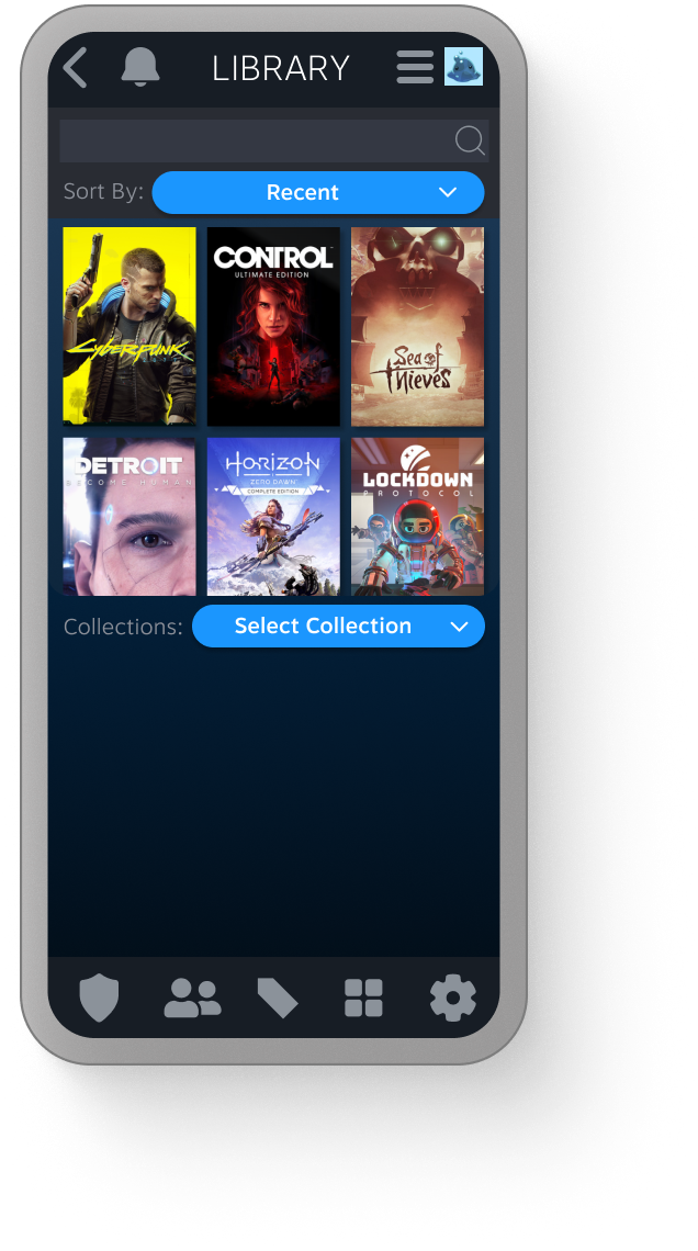
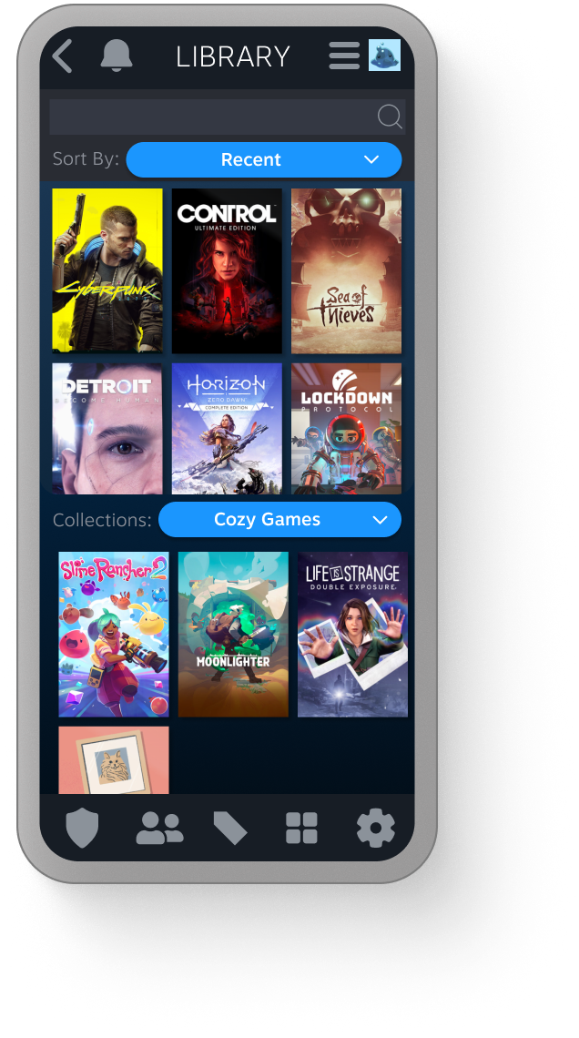
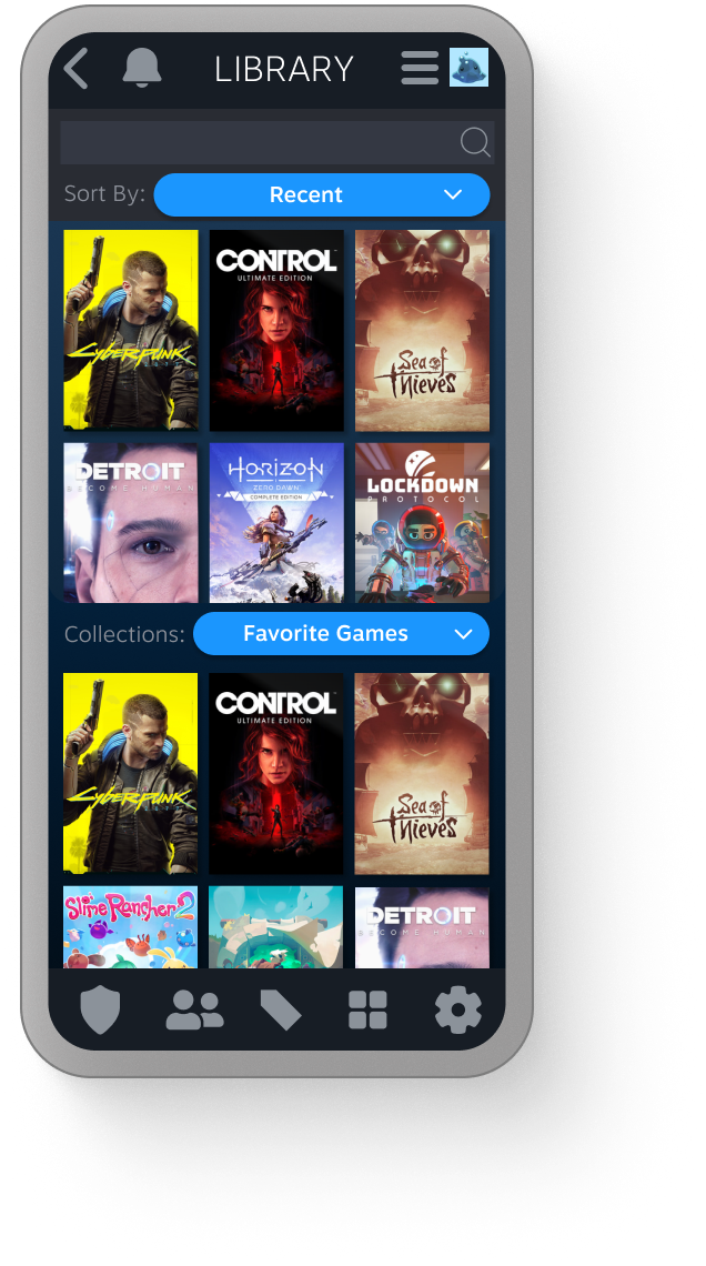
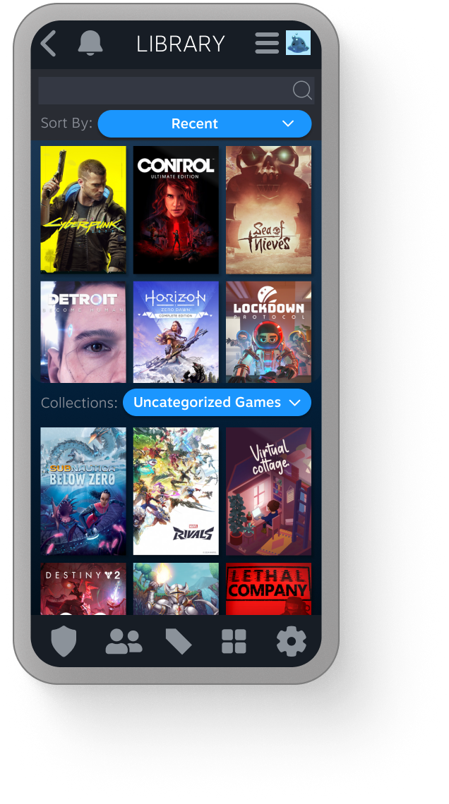
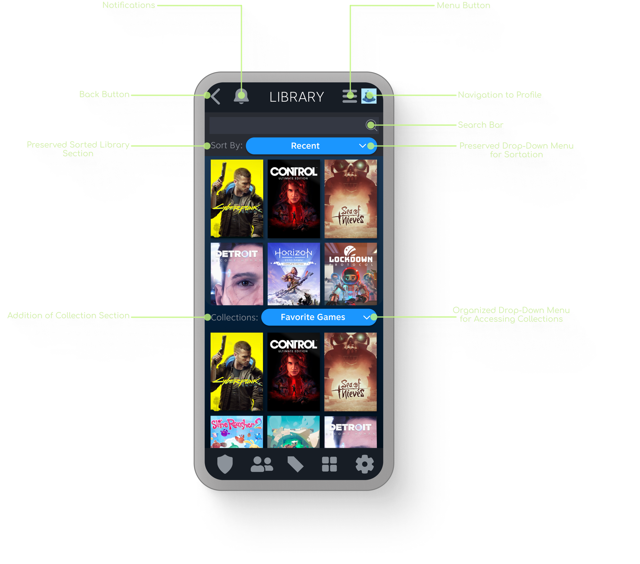
Library: Optimized Management
Mobile-First Integration: Relocated the Library to the primary hot-bar for instant access, shifting away from the previous menu-heavy navigation.
Enhanced Organization: Introduced a "Collections" drop-down menu to help users quickly filter and manage games during short mobile sessions.
Retained Familiarity: Preserved the standard sorting and filter functions to ensure long-time users can navigate their library without a steep learning curve.
Cognitive Comfort: Implemented rounded UI elements to "soften" the interface, reducing cognitive load and making the dense information architecture feel more approachable.
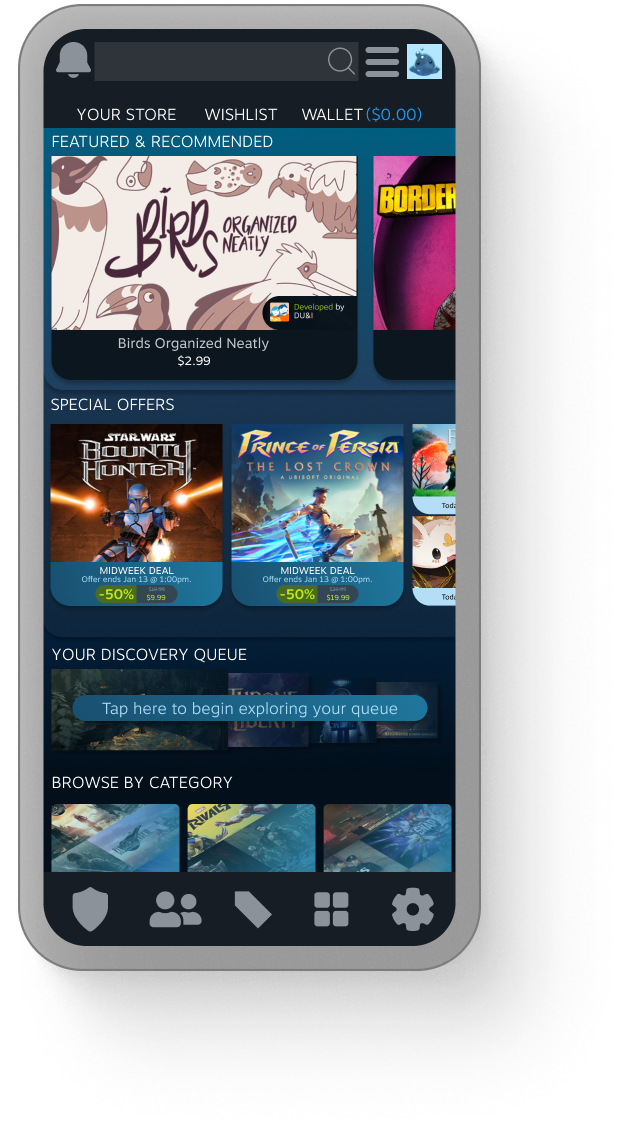
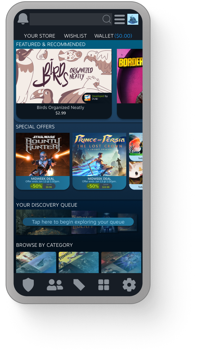
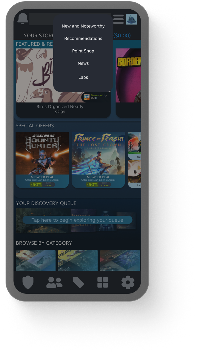
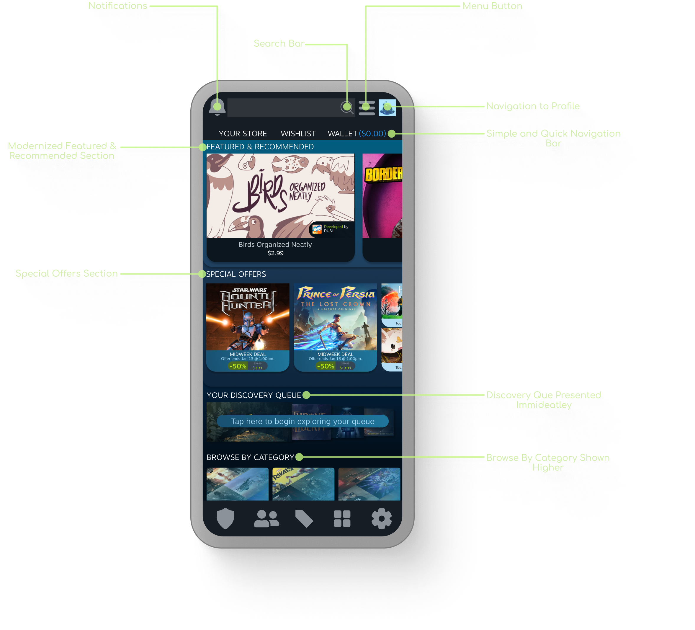
Store: Discovery and Browsing
Elevated Discovery: Positioned the "Discovery Queue" higher on the page to prioritize content exploration and user engagement.
Streamlined Browsing: Reorganized the "Browse by Category" section to enhance navigation efficiency for users looking to quickly find new titles.
Optimized Information Density: Redesigned main title layouts and moved secondary details into menus to reduce visual noise and cognitive load.
Modernized Visual Hierarchy: Implemented rounded design elements and cleaner content organization to create an intuitive, professional shopping experience.
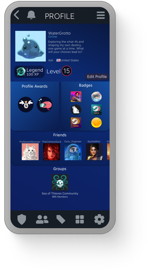
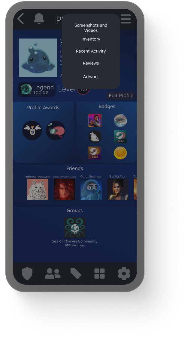
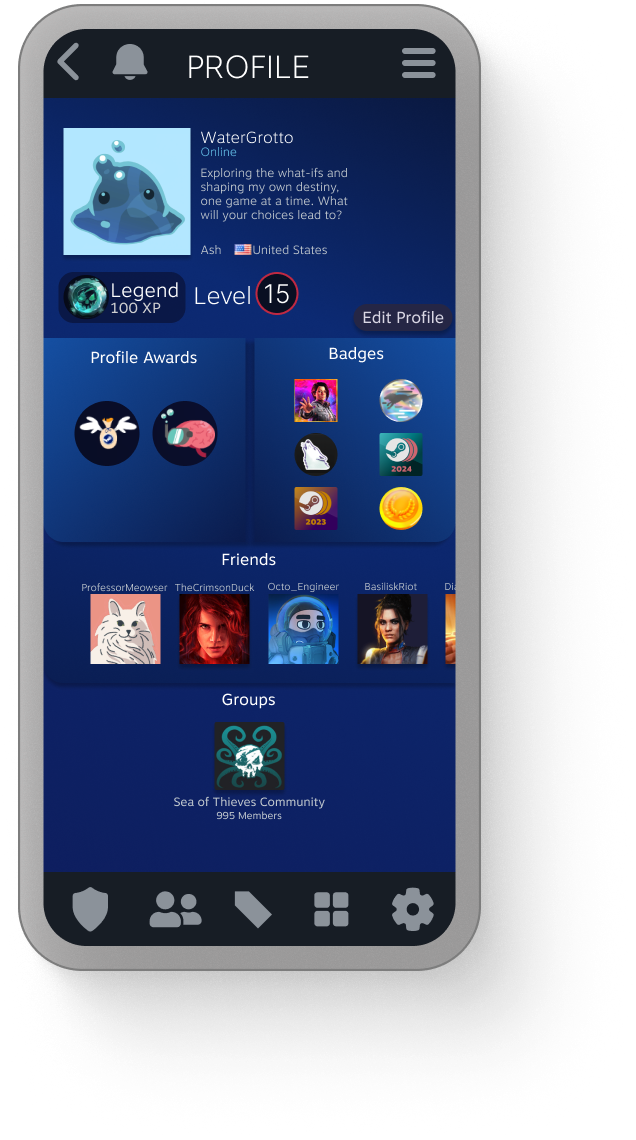
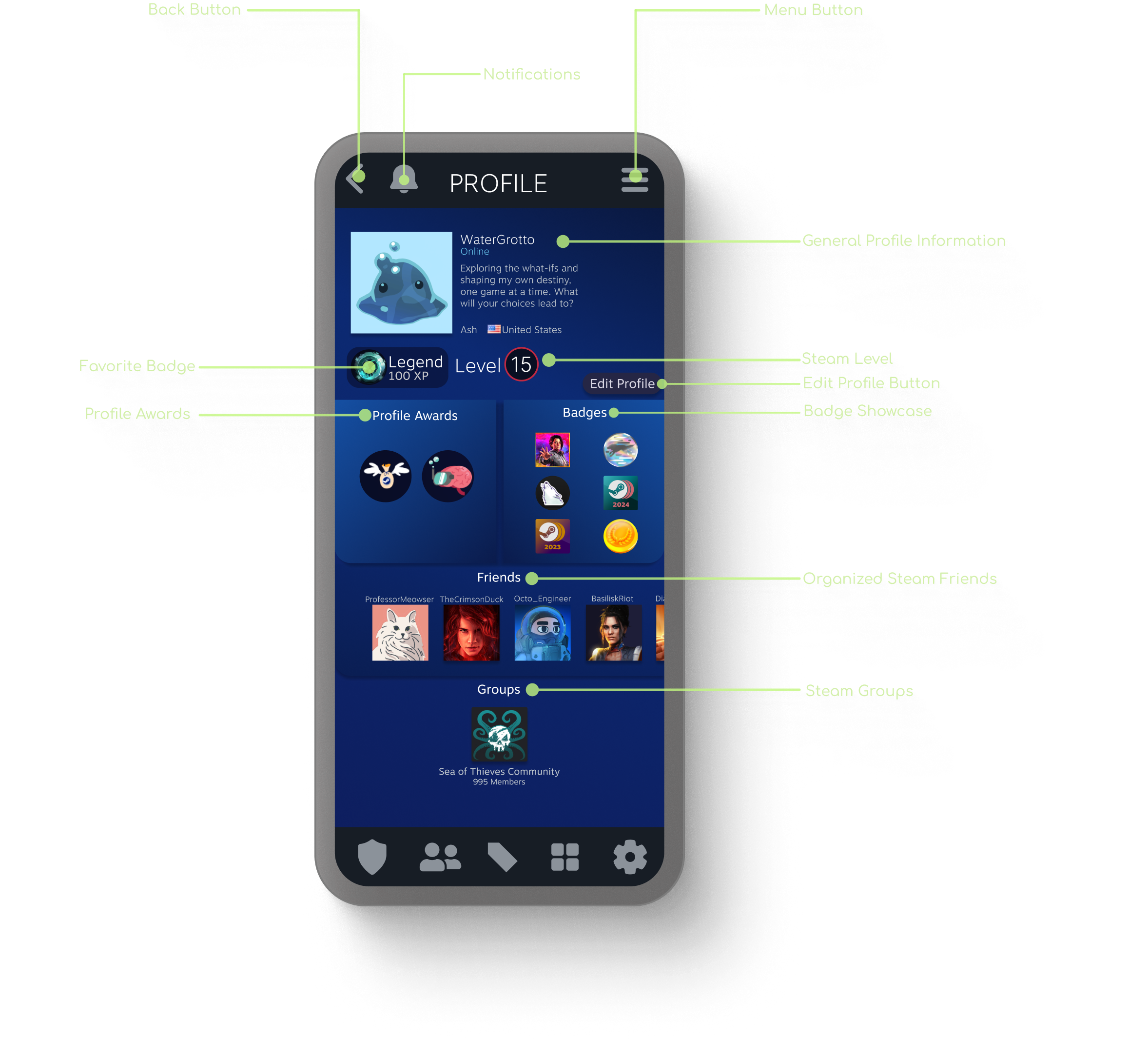
Profile: Personalized Clarity
Strategic Decluttering: Reorganized secondary profile metadata into a nested menu to reduce visual noise and highlight core user identity.
User-Centric Balance: Maintained the "personal" essence of the profile page while significantly improving navigation and visual clarity.
Optimized Scannability: Addressed research-identified pain points regarding "difficulty accessing information" by creating a cleaner, high-contrast visual hierarchy.
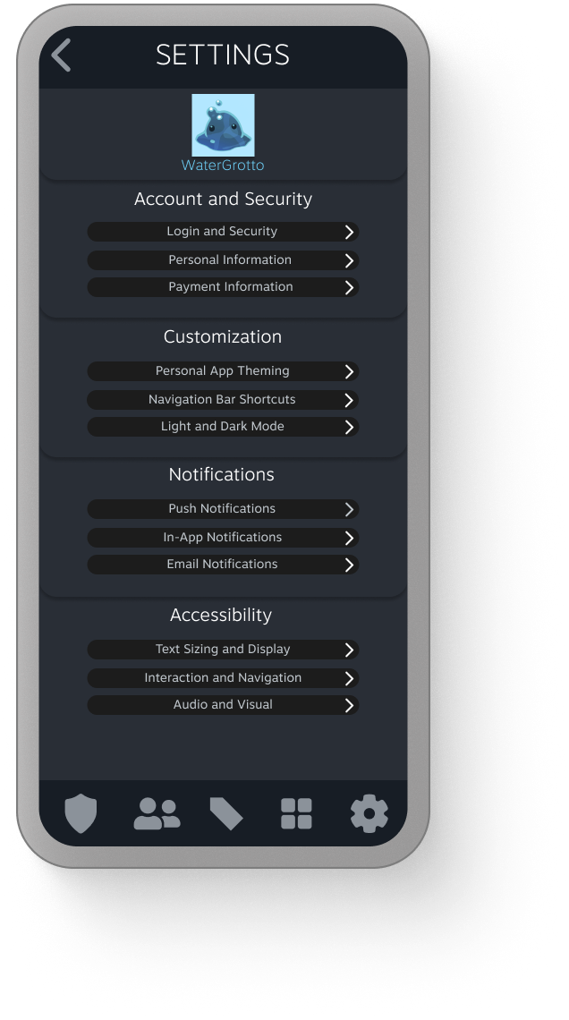
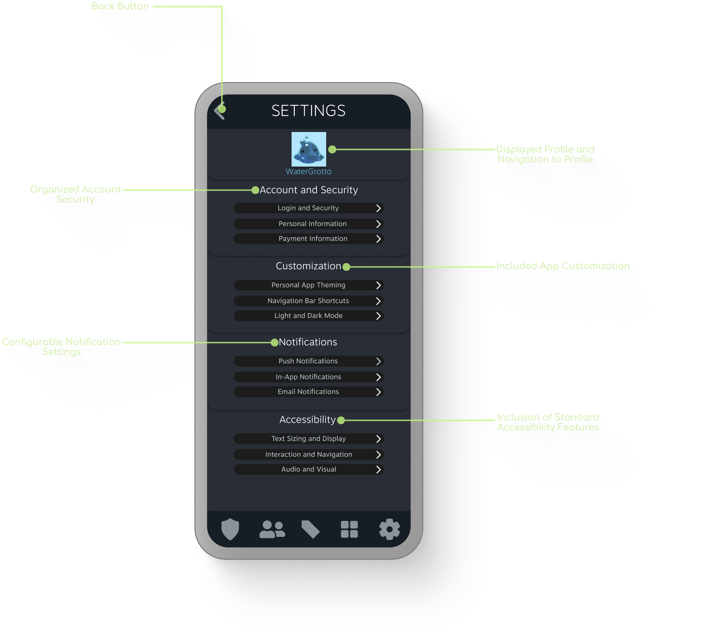
Settings: Centralized Control
Enhanced Discoverability: Relocated Settings to the primary hot-bar, directly addressing the research-identified pain point of navigation friction.
Categorized Architecture: Organized settings into logical subsections—Account & Security, Customization, Notifications, and Accessibility—to improve findability and reduce cognitive load.
Improved User Agency: Streamlined the account management workflow, providing "The Manager" archetype with rapid, effortless control over their app experience.
Conclusion
Outcomes and Results
A follow-up usability study was conducted to assess the redesigned app's exploration, feedback and impressions, and to establish scales for specific metrics. This allowed for a more in-depth understanding of how users interacted with the updated features and provided quantifiable data for future comparisons and iterations:
Efficiency:
4.6/5
4.6/5
Visual Appeal:
4.6/5
4.6/5
Overall Satisfaction:
5/5
5/5
To further illustrate the potential benefits of the redesigned and streamlined application, participant feedback provides compelling evidence.
Participant 3 highlighted the improved usability, stating their favorite feature was "The ease it is to use...the current steam app makes me have to search for things," suggesting a significant improvement in discoverability.
The consistent design language across platforms was also well-received, with Participant 5 noting, "Perfect, it matches the PC app, but on a mobile space now."
Furthermore, the overall positive impression of the redesign's improvements was clear, as Participant 5 concluded, "Just about in every way...this would be an app I would actively use," indicating a strong potential for user adoption and engagement.
These positive sentiments suggest that the proposed design has the potential to address key user pain points and offer a more satisfying mobile experience.
Iterative Learnings
✦Improved user research skills, including unbiased interviewing and effective use of participant quotes.
✦Clarified and refined my ideal personal design process.
✦Further solidified my personal branding within the design field.
✦Advanced Figma prototyping skills.
✦Increased confidence in approaching and executing future projects.
Future Directions
Future development of this hypothetical app redesign would involve iterative improvements based on user feedback and data analysis:
✦A/B testing of design variations for key features, such as navigation and search, would be conducted.
✦Continued user research, including usability testing and surveys, would be implemented to identify areas for refinement and ensure alignment with user needs.
✦Exploration of integrations with other platforms and expansion of the feature set based on user demand would also be considered.
✦Tracking of KPIs, such as user engagement and retention, would provide quantifiable data for measuring the redesign's success and informing future iterations.
UX Case Studies

Thank you! Your submission has been received!
Oops! Something went wrong while submitting the form.
